
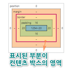
박스 모델은 모든 요소를 콘텐츠 → padding → border → margin 의 사각형으로 다루는 CSS 핵심 개념으로, 요소의 크기와 간격·정렬이 모두 이 구조에서 계산된다.
01. width,height
설명
요소의 가로 너비와 세로 높이를 지정한다. 최소/최대 크기를 제한하여 반응형 레이아웃에 활용할 수 있다.
| 값 | 설명 |
|---|---|
width |
요소의 콘텐츠 가로 너비 |
height |
요소의 콘텐츠 세로 높이 |
min-width |
요소의 최소 가로 너비 |
min-height |
요소의 최소 세로 높이 |
max-width |
요소의 최대 가로 너비 |
max-height |
요소의 최대 세로 높이 |
단위는
px,%,em,vw,vh등을 사용할 수 있으며,%는 부모 요소 기준으로 계산된다.
✔ BOXMODEL
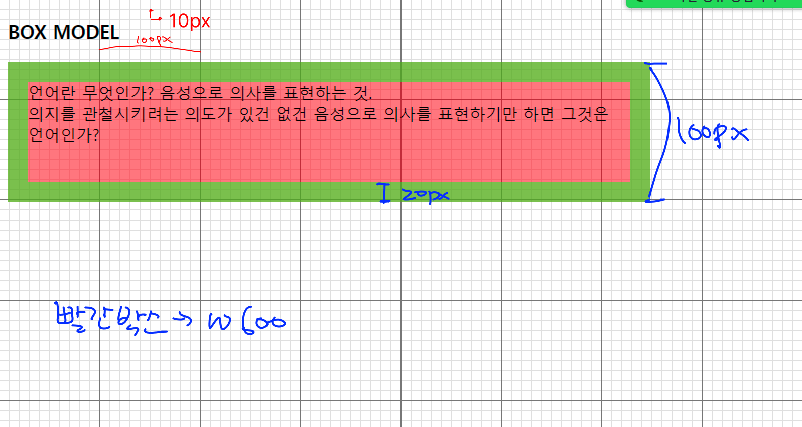
배경이미지 모눈 한개의 크기는 10px 입니다. (모눈의 눈금을 보고 박스의 크기를 확인하세요)
빨간 박스의 너비는 600px
초록색 테두리는 20px
박스의 총 높이는 100px 조건에 맞는 박스를 만들어보세요
시작 ex2-50.html
<!DOCTYPE html>
<html lang="ko">
<head>
<meta charset="utf-8">
<title>요소의 크기</title>
<style type="text/css">
</style>
</head>
<body>
    <h3>BOX MODEL</h3>
    <p>언어란 무엇인가? 음성으로 의사를 표현하는 것.<br> 의지를 관철시키려는 의도가 있건 없건 음성으로 의사를 표현하기만 하면 그것은 언어인가?</p>
</body>
</html>
완료 ex2-50.html
<!DOCTYPE html>
<html lang="ko">
<head>
<meta charset="utf-8">
<title>요소의 크기</title>
<style type="text/css">
	body{
    background:url(img/bg_grid.gif) ;
  }
  p{
    background-color: rgba(255,0,0,.5);
    width:600px;
    /* 박스의 최소높이 100px 고정 */
    min-height: 100px;
    border: 20px solid rgba(0,255,0,.5);
    /* width:640px */
  }
</style>
</head>
<body>
    <h3>BOX MODEL</h3>
    <p>언어란 무엇인가? 음성으로 의사를 표현하는 것.<br>언어란 무엇인가? 음성으로 의사를 표현하는 것.<br>언어란 무엇인가? 음성으로 의사를 표현하는 것.</p>
</body>
</html>
02. padding
설명
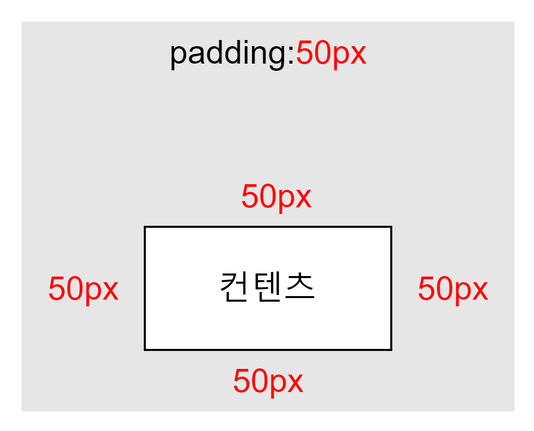
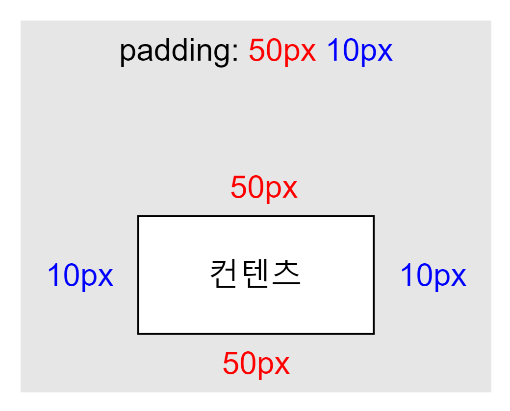
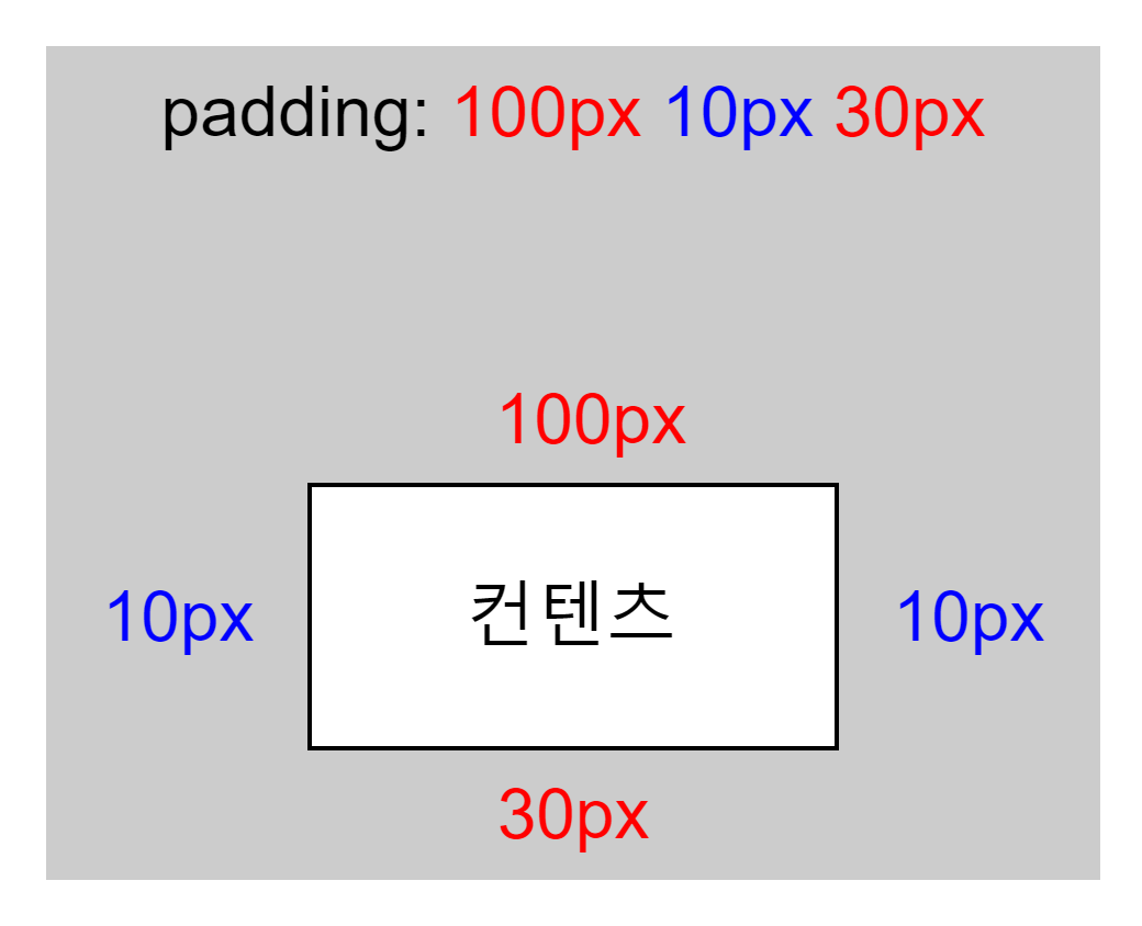
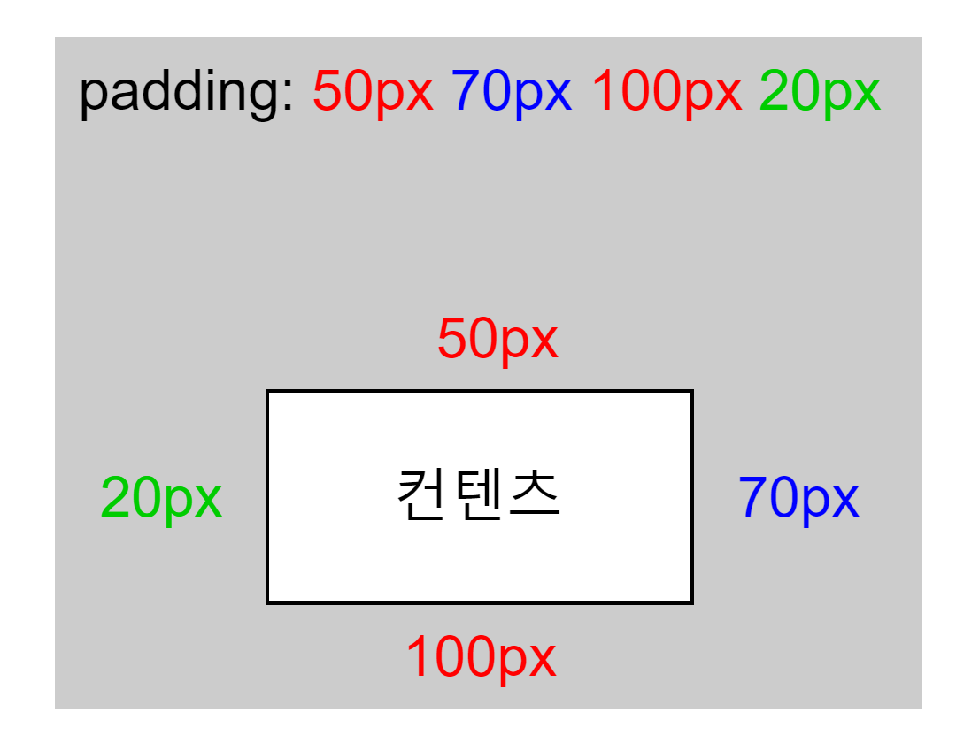
要素와 콘텐츠 사이의 안쪽 여백을 지정한다. 값의 개수에 따라 적용 방향이 달라진다.
| 값 개수 | 적용 방향 |
|---|---|
| 1개 | 상·우·하·좌 전체 동일 |
| 2개 | 상하 · 좌우 |
| 3개 | 상 · 좌우 · 하 |
| 4개 | 상 · 우 · 하 · 좌 (시계 방향) |
margin과 달리 음수 값을 사용할 수 없다. 자세한 내용은 🔗MDN 참고.
시작 ex2-51.html
<!DOCTYPE html>
<html lang="ko">
<head>
<meta charset="utf-8">
<title>요소의 안 여백</title>
<style type="text/css">
    body {
        background: url(img/bg_grid.gif);
        font:16px "Malgun Gothic";
    }
</style>
</head>
<body>
    <h3>BOX</h3>
    <p>철수가 영희에게 퍼블리셔란 무슨 일을 하는 직업이니? 하고 물었다.</p>
   <p>그러자 영희는 철수에게 아~ 그건 다 함께 잘 살기 위해 인터넷 선장이 되는 일이야 라고 말했다.</p>
</body>
</html>
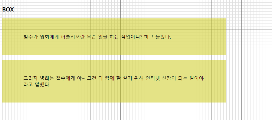
완료 ex2-51.html
<!DOCTYPE html>
<html lang="ko">
<head>
<meta charset="utf-8">
<title>요소의 안 여백</title>
<style type="text/css">
    body {
        background: url(img/bg_grid.gif);
        font:16px "Malgun Gothic";
    }
    p{
      background: rgba(200,200,0,.5);
      /* 너비를 600px로 ! */
      width: 600px;
      height:100px;
      padding:50px 70px;
      padding:50px 70px 100px;
      padding:50px 70px 100px 20px;
    }
</style>
</head>
<body>
    <h3>BOX</h3>
    <p>철수가 영희에게 퍼블리셔란 무슨 일을 하는 직업이니? 하고 물었다.</p>
   <p>그러자 영희는 철수에게 아~ 그건 다 함께 잘 살기 위해 인터넷 선장이 되는 일이야 라고 말했다.</p>
</body>
</html>
03. margin
설명
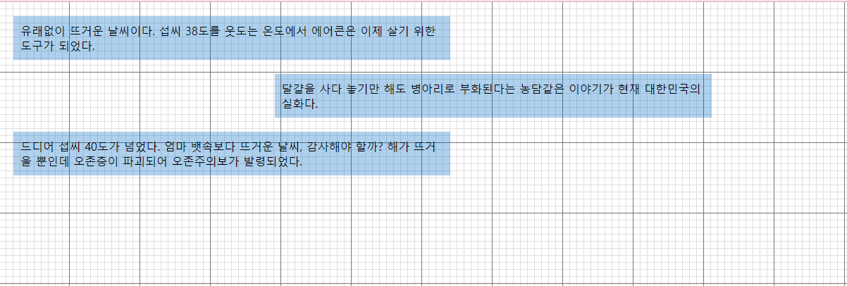
요소의 바깥쪽 여백을 지정하여 다른 요소와의 거리를 조절한다. margin: 0 auto로 블록 요소를 수평 중앙 정렬할 수 있다.
| 값 | 설명 |
|---|---|
margin |
상·우·하·좌 한 번에 지정 (padding과 동일한 개수 규칙) |
margin-top / margin-bottom |
위·아래 개별 마진 |
margin-left / margin-right |
좌·우 개별 마진 |
auto |
브라우저가 자동으로 계산 (중앙 정렬에 사용) |
인접한 블록 요소의 상하 마진은 큰 값 하나로 겹치는 '마진 상쇄' 현상이 발생한다. 자세한 내용은 🔗MDN 참고.
시작 ex2-52.html
<!DOCTYPE html>
<html lang="ko">
<head>
<meta charset="utf-8">
<title>요소의 바깥 여백</title>
<style type="text/css">
	body { background:url(img/bg_grid.png); }
</style>
</head>
<body>
    <p>유래없이 뜨거운 날씨이다. 섭씨 38도를 웃도는 온도에서 에어콘은 이제 살기 위한 도구가 되었다.</p>
    <p class="art2">달걀을 사다 놓기만 해도 병아리로 부화된다는 농담같은 이야기가 현재 대한민국의 실화다.</p>
    <p>드디어 섭씨 40도가 넘었다. 엄마 뱃속보다 뜨거운 날씨, 감사해야 할까? 해가 뜨거울 뿐인데 오존층이 파괴되어 오존주의보가 발령되었다.</p>
</body>
</html>
완료 ex2-52.html
<!DOCTYPE html>
<html lang="ko">
<head>
<meta charset="utf-8" />
<title>요소의 바깥 여백</title>
<style type="text/css">
body {
background: url(img/bg_grid.png);
}
p{
background: rgba(0,100,200,.3);
width:600px;
padding:10px;
/* 상단마진겹칩현상발생
상하 마진 적용시 위/아래 한쪽방향으로만 코딩
*/
margin:20px;
/* 큰값으로 합체 */
margin-top:50px;
}
.art2{
/* 마진으로 중앙정렬은 수평만 가능
- 너비가 있다.
- 좌우를 auto 로 준다.
*/
width:300px;
margin: 0 auto;
margin-top: 0;
margin-right: auto;
margin-bottom: 0;
margin-left: auto;
}
</style>
</head>
<body>
<p>
유래없이 뜨거운 날씨이다. 섭씨 38도를 웃도는 온도에서 에어콘은 이제 살기
위한 도구가 되었다.
</p>
<p class="art2">
달걀을 사다 놓기만 해도 병아리로 부화된다는 농담같은 이야기가 현재
대한민국의 실화다.
</p>
<p>
드디어 섭씨 40도가 넘었다. 엄마 뱃속보다 뜨거운 날씨, 감사해야 할까? 해가
뜨거울 뿐인데 오존층이 파괴되어 오존주의보가 발령되었다.
</p>
</body>
</html>
04. border
설명
요소의 테두리 스타일, 두께, 색상을 지정한다. border는 border-width, border-style, border-color의 shorthand이다. outline은 보더와 유사하지만 레이아웃 공간에 영향을 주지 않는다.
| 값 | 설명 |
|---|---|
border-style |
테두리 스타일 (solid, dotted, dashed, double, groove, ridge, inset, outset) |
border-width |
테두리 두께 |
border-color |
테두리 색상 |
border |
위 세 가지를 한 번에 지정 (예: border: 1px solid #000) |
outline |
요소 바깥 외곽선 (공간 차지 안 함) |
outline-offset |
outline과 요소 사이 간격 |
border-style은 반드시 지정해야 하며, 생략 시 테두리가 표시되지 않는다.
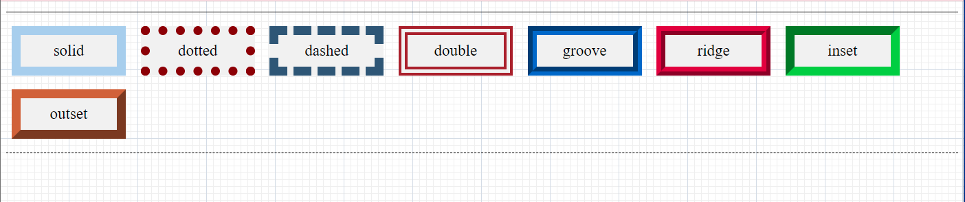
시작 ex2-53.html
<!DOCTYPE html>
<html lang="ko">
<head>
<meta charset="utf-8">
<title>테두리 모양</title>
<style type="text/css">
	body { background:url(img/bg_grid.png); }
</style>
</head>
<body>
    <div class="brdr">
        <p class="p1">solid</p>
        <p class="p2">dotted</p>
        <p class="p3">dashed</p>
        <p class="p4">double</p>
        <p class="p5">groove</p>
        <p class="p6">ridge</p>
        <p class="p7">inset</p>
        <p class="p8">outset</p>
    </div>
</body>
</html>
완료 ex2-53.html
<!DOCTYPE html>
<html lang="ko">
<head>
  <meta charset="utf-8">
  <title>테두리 모양</title>
  <style type="text/css">
    body {
      background: url(img/bg_grid.png);
    }
    .brdr {
      border: 2px solid #ccc;
      border-top: 1px solid #000;
      border-bottom: 1px solid #000;
      /* 너비500px 수평중앙정렬 */
      width: 500px;
      margin: auto;
    }
    p {
      width: 120px;
      width: 94px;
      display: inline-block;
      padding: 10px;
      text-align: center;
      background: rgb(194, 208, 232);
      font: 23px Times;
      margin:10px 8px;
      border-width:13px;
      border-color:firebrick;
      border-style:solid;
      border:13px firebrick solid;
    }
    .p1{border-style:solid;}
    .p2{border-style:dotted;}
    .p3{border-style:dashed;}
    .p4{border-style:double;}
    .p5{border-style:groove;}
    .p6{border-style:ridge;}
    .p7{border-style:inset;}
    .p8{border-style:outset;}
  </style>
</head>
<body>
  <div class="brdr">
    <p class="p1">solid</p>
    <p class="p2">dotted</p>
    <p class="p3">dashed</p>
    <p class="p4">double</p>
    <p class="p5">groove</p>
    <p class="p6">ridge</p>
    <p class="p7">inset</p>
    <p class="p8">outset</p>
  </div>
</body>
</html>
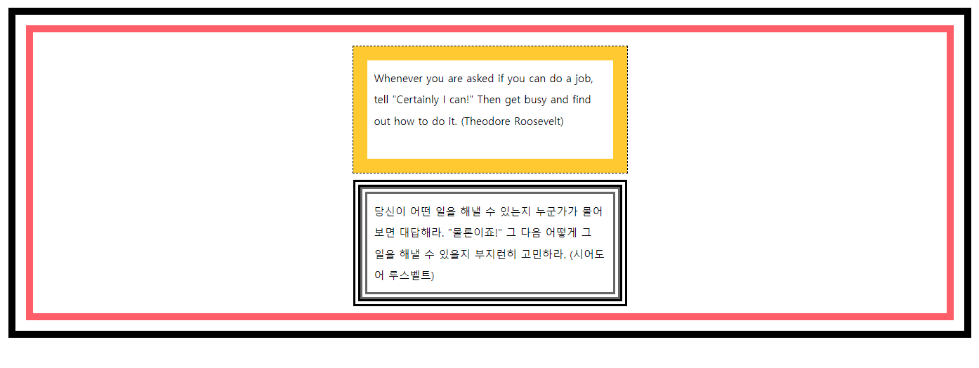
시작 ex2-53-1.html
<!DOCTYPE HTML>
<html>
<head>
<title> 테두리 외곽에 아우트라인 처리하기 </title>
<meta charset="UTF-8" />
<style type="text/css">
</style>
</head>
<body>
<div>
<p class="border1">
Whenever you are asked if you can do a job, tell
"Certainly I can!" Then get busy and find out how to do it.
(Theodore Roosevelt)
</p>
<p class="border2">
당신이 어떤 일을 해낼 수 있는지 누군가가 물어보면 대답해라.
"물론이죠!" 그 다음 어떻게 그 일을 해낼 수 있을지 부지런히 고민하라.
(시어도어 루스벨트)
</p>
</div>
</body>
</html>
완료 ex2-53-1.html
<!DOCTYPE html>
<html>
<head>
<title>테두리 외곽에 아우트라인 처리하기</title>
<meta charset="UTF-8" />
<style type="text/css">
body {
font:0.95em "맑은 고딕",sans-serif;
margin:40px;
}
div{
border:10px solid #ff6666;
outline-width:10px;
outline-style:solid;
outline-offset:15px;
outline-color:#ff6666;
padding:40px;
}
p{
line-height: 200%;
padding:10px;
width:330px;
height: 120px;
margin: 0 auto;
}
.border1{
border:20px solid #ffcc00;
outline: dashed 1px #000;
margin-bottom: 20px;
}
.border2{
border:10px double #ffcc00;
outline: double 10px rgb(10, 33, 240);
}
</style>
</head>
<body>
<div>
<p class="border1">
Whenever you are asked if you can do a job, tell "Certainly I
can!" Then get busy and find out how to do it. (Theodore Roosevelt)
</p>
<p class="border2">
당신이 어떤 일을 해낼 수 있는지 누군가가 물어보면 대답해라.
"물론이죠!" 그 다음 어떻게 그 일을 해낼 수 있을지 부지런히
고민하라. (시어도어 루스벨트)
</p>
</div>
</body>
</html>
05. border-radius
설명
요소의 테두리 모서리를 둥글게 만든다. 각 모서리별로 반지름을 지정할 수 있으며, 값을 1~4개 사용하여 다양한 둥근 모양을 만들 수 있다.
| 값 개수 | 적용 방향 |
|---|---|
| 1개 | 네 모서리 동일 |
| 2개 | 좌상+우하 · 우상+좌하 |
| 3개 | 좌상 · 우상+좌하 · 우하 |
| 4개 | 좌상 · 우상 · 우하 · 좌하 (시계 방향) |
/ 구분 |
border-radius: 수평반지름 / 수직반지름 (타원형 모서리) |
border-radius: 50%를 정사각형 요소에 적용하면 완전한 원이 된다.

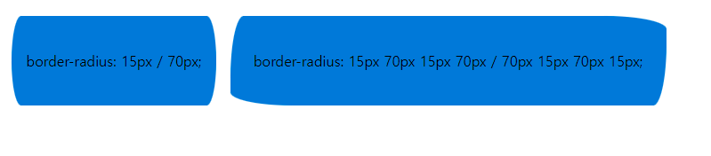
시작 ex2-54.html
<!DOCTYPE html>
<html lang="ko">
<head>
<meta charset="utf-8">
<title>둥근 테두리</title>
<style>
</style>
</head>
<body>
   <span class="radius radius1">radius1</span>
   <span class="radius radius2">radius2</span>
   <span class="radius radius3">radius3</span>
   <span class="radius radius4">radius4</span>
</body>
</html>
완료 ex2-54.html
<!DOCTYPE html>
<html lang="ko">
  <head>
    <meta charset="utf-8" />
    <title>둥근 테두리</title>
    <style>
      .radius {
        display: inline-block;
        text-align: center;
        line-height: 100px;
      }
      .radius1 {
        width: 100px;
        height: 100px;
        background-color: #cc6;
        border-radius: 100px;
      }
      .radius2 {
        width: 200px;
        height: 100px;
        border-radius: 100px 100px 0 0;
        background-color: cadetblue;
      }
      .radius3 {
        width: 100px;
        height: 100px;
        border-radius: 200px 0 0 0;
        background-color: #d14419;
      }
      .radius4 {
        width: 200px;
        height: 100px;
        background-color: cadetblue;
        border-radius: 40px 15px 50px;
        border: 4px dotted #800;
      }
      /*
    3개 -> 좌상 우상+좌하 우하
    2개 ->  좌상+우하 우상+좌하
  */
      span:nth-child(5),
      span:nth-child(6) {
        display: block;
        width: 430px;
        height: 100px;
        background: pink;
        margin: 10px auto;
      }
      .radius5 {
        border-radius: 15px / 70px;
      }
      .radius6 {
        border-radius: 15px 70px 15px 70px / 70px 15px 70px 15px;
      }
    </style>
  </head>
  <body>
    <span class="radius radius1">radius1</span>
    <span class="radius radius2">radius2</span>
    <span class="radius radius3">radius3</span>
    <span class="radius radius4">radius4</span>
    <span class="radius radius5">radius5 ///width:430px;height:100px; </span>
    <span class="radius radius6">radius6</span>
  </body>
</html>
06. border-image
설명
이미지를 요소의 테두리로 사용한다. 이미지를 9개의 영역(4개 모서리, 4개 측면, 중앙)으로 나누어 테두리에 적용한다.
| 값 | 설명 |
|---|---|
border-image-source |
사용할 이미지 URL 또는 gradient |
border-image-slice |
이미지를 자를 오프셋 (숫자 또는 %) |
border-image-width |
테두리 이미지의 너비 |
border-image-outset |
테두리 바깥으로 확장할 크기 |
border-image-repeat |
반복 방식 (stretch, repeat, round, space) |
border-image |
위 값을 한 번에 지정 |
border-image사용 시border속성도 함께 설정해야 이미지가 잘린다. 자세한 내용은 🔗MDN 참고.
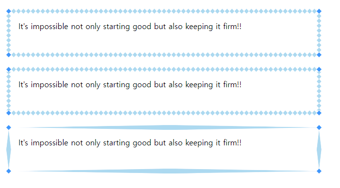
시작 ex2-56.html
<!DOCTYPE html>
<html lang="ko">
<head>
<meta charset="utf-8">
<title>테두리 이미지</title>
<style>
</style>
</head>
<body>
     <div class="round">
         It's impossible not only starting good but also keeping it firm!!</div>
     <div class="repeat">
         It's impossible not only starting good but also keeping it firm!!</div>
     <div class="stretch">
         It's impossible not only starting good but also keeping it firm!!</div>
</body>
</html>
완료 ex2-56.html
<!DOCTYPE html>
<html lang="ko">
  <head>
    <meta charset="utf-8" />
    <title>테두리 이미지</title>
    <style>
      body {
        margin: 20px;
      }
      div {
        width: 600px;
        height: 50px;
        padding: 15px;
        border: 10px solid transparent;
      }
      .round {
        border-image: url(img/border.png) 20;
        /* 이미지 | 슬라이스 */
        border-image: linear-gradient(red, blue) 27;
      }
      .repeat {
        border-image: url(img/border.png) 20 repeat;
      }
      .stretch {
        border-image: url(img/border.png) 20 stretch;
      }
    </style>
  </head>
  <body>
    <div class="round">
      It's impossible not only starting good but also keeping it firm!!
    </div>
    <div class="repeat">
      It's impossible not only starting good but also keeping it firm!!
    </div>
    <div class="stretch">
      It's impossible not only starting good but also keeping it firm!!
    </div>
  </body>
</html>

border-image: url(img/border.png) 20에서 20이 slice 값이다. 단위가 없으면 픽셀로 해석한다. 네 변에서 각각 20px 안쪽에 선을 그어 이미지를 9조각으로 나눈다.
- 모서리 4개: 크기 그대로 테두리 네 귀퉁이에 고정된다.
- 변 4개: 테두리 길이에 맞춰 늘어난다(
stretch기본값). 위·아래는 가로로, 좌·우는 세로로. - 가운데 1개: 기본은 버려진다. 보이게 하려면
fill을 붙인다 →... 20 fill.
border-image
#### 예제
<!DOCTYPE HTML>
<html lang="en">
<head>
	<meta http-equiv="Content-Type" content="text/html; charset=utf-8">
	<title>Border Image</title>
	<style>
		div {
			/* 단위 안쓰면 px */
			border-image: url(border.jpg) 45 fill / auto repeat;
			width: 600px;
			height: 300px;
			margin: 150px auto;
		}
	</style>
</head>
<body>
	<div></div>
</body>
</html>
border-image-slice
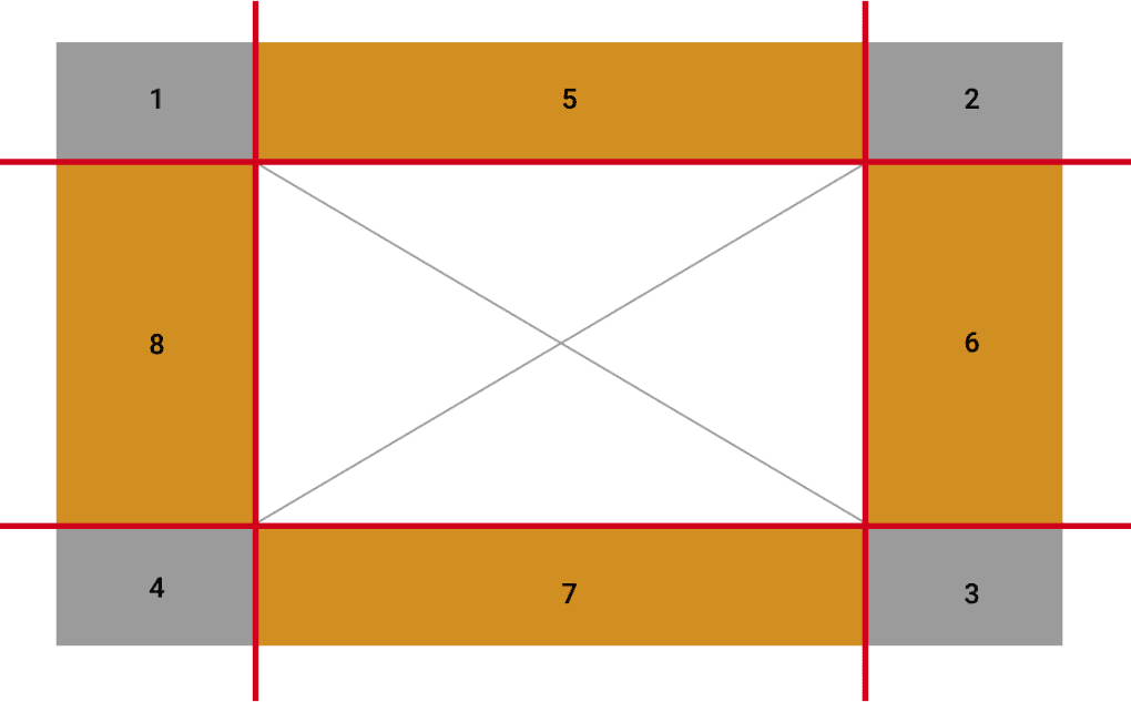
border-image-slice : 브라우저에게 테두리 조각을 만들기 위해 이미지를 슬라이스할 위치를 알려준다.
/* 모든 방향 */
border-image-slice: 30%;
/* 세로방향 | 가로방향 */
border-image-slice: 10% 30%;
/* 위 | 가로방향 | 아래 */
border-image-slice: 30 30% 45;
/* 위 | 오른쪽 | 아래 | 왼쪽 */
border-image-slice: 7 12 14 5;
/* fill 키워드 */
border-image-slice: 10% fill 7 12;
/* 전역 값 */
border-image-slice: inherit;
border-image-slice: initial;
border-image-slice: unset;
이미지는 4개 모서리, 4개 측면, 중앙의 9개 섹션으로 나뉜다.
브라우저에게 테두리 조각을 만들기 위해 이미지를 슬라이스할 위치를 알려준다.
border-image-slice: [ number | percentage ] | fill | initial | inherit
07. box-sizing
설명
요소의 크기 계산 기준을 설정한다. content-box(기본값)는 콘텐츠 크기만 적용되고, border-box는 padding과 border를 포함한 총 크기를 지정 값으로 계산한다.
| 값 | 설명 |
|---|---|
content-box |
width/height = 콘텐츠 크기 (padding, border 별도 추가) |
border-box |
width/height = padding + border + 콘텐츠 (실무에서 주로 사용) |
* { box-sizing: border-box; }로 전역 설정하면 레이아웃 계산이 훨씬 직관적이다.

시작 ex2-57.html
<!DOCTYPE html>
<html lang="ko">
<head>
<meta charset="utf-8">
<title>box-sizing</title>
<style>
- { margin: 0; padding: 0; }
body { background: url(img/bg_grid.png); }
</style>
</head>
<body>
<p>It's impossible not only starting good but also keeping it firm!!</p>
<p class="sizing">It's impossible not only starting good but also keeping it firm!!</p>
<ul class="sizing_list">
<li><a href="#">Company</a></li>
<li><a href="#">Service</a></li>
<li><a href="#">Custommer</a></li>
<li><a href="#">Community</a></li>
</ul>
</body>
</html>
완료 ex2-57.html
<!DOCTYPE html>
<html lang="ko">
<head>
<meta charset="utf-8" />
<title>box-sizing</title>
<style>
- {
margin: 0;
padding: 0;
border: 0;
}
body {
background: url(img/bg_grid.png);
}
p {
background-color: rgba(255,255,0,.5);
border:10px solid rgba(0,0,0,0.5);
width:600px;
height:100px;
padding:30px;
margin-bottom: 10px;
}
.sizing{
/* box-sizing :
border-box
크기=패딩+보더+콘텐츠박스
content-box
크기=(패딩)+(보더)+(콘텐츠박스 )
*/
width:500px;
height:200px;
padding:50px;
border:15px solid red;
box-sizing: border-box;
overflow: hidden;
}
.sizing_list{
width:500px;
margin-top: 20px;
margin: auto;
}
.sizing_list li{
list-style: none;
width:25%;
float:left;
background: rgba(0,0,0,0.5);
padding:10px;
box-sizing: border-box;
text-align: center;
}
.sizing_list li a{
text-decoration: none;
color:#fff;
}
.sizing_list li:hover a{
text-decoration: underline;
color:#fff;
}
.sizing_list li:nth-child(odd){
background: rgba(219, 95, 95, 0.5);
}
</style>
</head>
<body>
<p>It's impossible not only starting good but also keeping it firm!!</p>
<p class="sizing">
It's impossible not only starting good but also keeping it firm!!
</p>
<ul class="sizing_list">
<li><a href="#">Company</a></li>
<li><a href="#">Service</a></li>
<li><a href="#">Custommer</a></li>
<li><a href="#">Community</a></li>
</ul>
</body>
</html>
08. box-shadow
설명
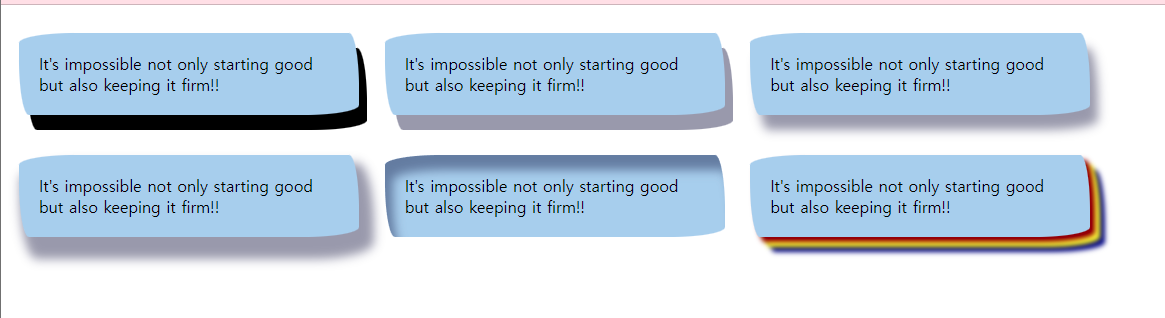
요소에 그림자 효과를 추가한다. 수평/수직 오프셋, 흐림 반경, 확장 반경, 색상을 지정할 수 있으며 inset 키워드로 안쪽 그림자를 만들 수 있다.
| 값 | 설명 |
|---|---|
h-shadow |
수평 오프셋 (양수=오른쪽, 음수=왼쪽) |
v-shadow |
수직 오프셋 (양수=아래, 음수=위) |
blur |
흐림 반경 (클수록 부드러운 그림자) |
spread |
그림자 확장/축소 크기 |
color |
그림자 색상 |
inset |
안쪽 그림자로 변경 (생략 시 바깥 그림자) |
box-shadow는 쉼표로 구분하여 여러 개의 그림자를 겹쳐 지정할 수 있다. 다중 그림자 활용 시 입체감이 살아난다.
시작 ex2-58.html
<!DOCTYPE html>
<html lang="ko">
<head>
<meta charset="utf-8">
<title>box-shadow</title>
<style>
</style>
</head>
<body>
     <p class="shadow1">It's impossible not only starting good but also keeping it firm!!</p>
     <p class="shadow2">It's impossible not only starting good but also keeping it firm!!</p>
     <p class="shadow3">It's impossible not only starting good but also keeping it firm!!</p>
     <p class="shadow4">It's impossible not only starting good but also keeping it firm!!</p>
     <p class="shadow5">It's impossible not only starting good but also keeping it firm!!</p>
     <p class="shadow6">It's impossible not only starting good but also keeping it firm!!</p>
</body>
</html>
완료 ex2-58.html
<!DOCTYPE html>
<html lang="ko">
  <head>
    <meta charset="utf-8" />
    <title>box-shadow</title>
    <style>
      p {
        display: inline-block;
        width: 300px;
        padding: 20px;
        border-radius: 55px 10px / 10px 50px;
        background-color: #abcdef;
      }
      .shadow1{box-shadow: 8px 15px;}
      .shadow2{box-shadow: 8px 15px rgba(0,0,50,.4);}
      .shadow3{box-shadow: 8px 15px 8px rgba(255, 255, 0,.5);}
      .shadow4{box-shadow: 8px 15px 8px 7px rgba(0,0,50,.4);}
      .shadow5{box-shadow: 8px 15px 10px inset rgba(0,0,50,.4);}
      .shadow6{box-shadow:-8px -6px 8px 8px darkblue, 13px 9px 20px 9px #ff9409;}
    </style>
  </head>
  <body>
    <p class="shadow1">
      It's impossible not only starting good but also keeping it firm!!
    </p>
    <p class="shadow2">
      It's impossible not only starting good but also keeping it firm!!
    </p>
    <p class="shadow3">
      It's impossible not only starting good but also keeping it firm!!
    </p>
    <p class="shadow4">
      It's impossible not only starting good but also keeping it firm!!
    </p>
    <p class="shadow5">
      It's impossible not only starting good but also keeping it firm!!
    </p>
    <p class="shadow6">
      It's impossible not only starting good but also keeping it firm!!
    </p>
  </body>
</html>