스킬바
1. 스킬바 막대형
섹션 제목: “1. 스킬바 막대형”<div class="content">contents</div><div class="animation"> <div class="progress-bar"> <div class="bar"></div> <div class="rate" data-rate="30"></div> </div> <div class="progress-bar"> <div class="bar"></div> <div class="rate" data-rate="90"></div> </div> <div class="progress-bar"> <div class="bar"></div> <div class="rate" data-rate="60"></div> </div></div><div class="content">contents</div> .progress-bar { position: relative; width: 960px; height: 30px; margin: 3em auto; border: 1px solid green; } .progress-bar .bar { position: absolute; left: 0; top: 0; bottom: 0; width: 0; background: green; } .progress-bar .rate { position: absolute; top: 0; right: 15px; bottom: 0; line-height: 30px; font-size: 1.2em; color: green; } .content { height: 800px; font-size: 3em; } $(function () { var progressWrap = $('.progress-bar'); var animationOst = $('.animation').offset().top - 600; var isAni = false; $(window).scroll(function () { if ($(window).scrollTop() >= animationOst && !isAni) { progressAnimation(); } });
function progressAnimation() { progressWrap.each(function () { var $this = $(this), progressBar = $this.find('.bar'), progressText = $this.find('.rate'), progressRate = progressText.attr('data-rate'); progressBar.animate({ width: progressRate + '%' }, 2500); // console.log(progressText); var text = function () { $({ rate: 0 }).animate( { rate: progressRate }, { duration: 2000, progress: function () { var now = this.rate; console.log(now); progressText.text(Math.floor(now) + '%'); }, complete: function () { isAni = true; }, } ); }; text(); }); } });1.1. 스킬바 원형
섹션 제목: “1.1. 스킬바 원형”<section> <h2>content</h2></section><div class="charts"> <div class="chart"> <h2 data-num="20">0</h2> <svg> <circle cx="110" cy="110" r="100"></circle> </svg> </div> <div class="chart"> <h2 data-num="60">0</h2> <svg> <circle cx="110" cy="110" r="100"></circle> </svg> </div> <div class="chart"> <h2 data-num="80">0</h2> <svg> <circle cx="110" cy="110" r="100"></circle> </svg> </div> <div class="chart"> <h2 data-num="50">0</h2> <svg> <circle cx="110" cy="110" r="100"></circle> </svg> </div></div><section> <h2>content</h2></section>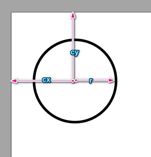
  .charts {    width: 80%;    margin: 3rem auto;    display: flex;    justify-content: center;  }  .charts .chart {    margin: 0 20px;    position: relative;  }  .charts .chart h2 {    position: absolute;    left: 50%;    top: 50%;    transform: translate(-50%, -50%);    margin: 0;  }  .charts .chart svg {    width: 220px;    height: 220px;  }  circle {    fill: #ffffff;    stroke-width: 20;    stroke-dasharray: 628;    stroke-dashoffset: 628;    /* animation:line 2s forwards; */    transform: rotate(-90deg);    transform-origin: 50% 50%;    stroke-linecap: round;  }  @keyframes line {    from {      stroke-dashoffset: 628;    }    to {      stroke-dashoffset: 0;    }  }  .charts .chart:nth-child(1) circle {    stroke: #ffc114;  }  .charts .chart:nth-child(2) circle {    stroke: #ff5248;  }  .charts .chart:nth-child(3) circle {    stroke: #19cdca;  }  .charts .chart:nth-child(4) circle {    stroke: #4e88e1;  }
  section {    height: 100vh;  }
line { stroke: #4e88e1; }$(function () { var charts = $('.charts'); var chart = $('.chart'); var chartOST = chart.offset().top - 700; // var excuted = false; // console.log(excuted);
$(window).scroll(function () { var currentSCT = $(this).scrollTop(); if (currentSCT >= chartOST) { if (!charts.hasClass('active')) { animateChart(); charts.addClass('active'); } } });
function animateChart() { chart.each(function () { var item = $(this); var title = item.find('h2'); var targetNum = title.attr('data-num'); var circle = item.find('circle');
$({ rate: 0 }).animate( { rate: targetNum }, { duration: 1500, progress: function () { var now = this.rate; var amount = 630 - (630 * now) / 100;
title.text(Math.floor(now)); circle.css({ strokeDashoffset: amount }); }, } ); }); //chart each }});1.2. 막대형2
섹션 제목: “1.2. 막대형2” <section> <h2>content</h2> </section> <div class="charts"> <div class="chart"> <h2 data-num="20">0</h2> <svg> <line x1="0" y1="0" x2="500" y2="0"></line> </svg> </div> <div class="chart"> <h2 data-num="20">0</h2> <svg> <line x1="0" y1="0" x2="500" y2="0"></line> </svg> </div> <div class="chart"> <h2 data-num="80">0</h2> <svg> <line x1="0" y1="0" x2="500" y2="0"></line> </svg> </div> </div> <section> <h2>content</h2> </section>.charts { width: 80%; margin: 3rem auto; display: flex; justify-content: center;}
.charts .chart { margin: 0 20px; position: relative;}
.charts .chart h2 { position: absolute; left: 50%; top: 50%; transform: translate(-50%, -50%); margin: 0;}
line { fill: #ebebeb; stroke-width: 20; stroke-dasharray: 300; stroke-dashoffset: 300;}
/* @keyframes line { from {stroke-dashoffset: 628;} to {stroke-dashoffset: 0;}} */.charts .chart:nth-child(1) line { stroke: #ffc114;}
.charts .chart:nth-child(2) line { stroke: #ff5248;}
.charts .chart:nth-child(3) line { stroke: #19cdca;}
.charts .chart:nth-child(4) line { stroke: #4e88e1;}
section { height: 100vh;}
line { stroke: #4e88e1;}var charts = $('.charts');var chart = $('.chart');var chartOST = chart.offset().top - 700;// var excuted = false;// console.log(excuted);
$(window).scroll(function () { var currentSCT = $(this).scrollTop(); if (currentSCT >= chartOST) { if (!charts.hasClass('active')) { animateChart(); charts.addClass('active'); } }});
function animateChart() { chart.each(function () { var item = $(this); var title = item.find('h2'); var targetNum = title.attr('data-num'); var circle = item.find('line');
$({ rate: 0 }).animate( { rate: targetNum }, { duration: 1500, progress: function () { var now = this.rate; var amount = 300 - (300 * now) / 100;
title.text(Math.floor(now)); circle.css({ strokeDashoffset: amount }); }, } ); }); //chart each}2. with GSAP
섹션 제목: “2. with GSAP”gsap 을 사용해보자
<script src="https://cdnjs.cloudflare.com/ajax/libs/gsap/3.12.5/gsap.min.js"></script><script src="https://cdn.jsdelivr.net/npm/gsap@3.12.5/dist/ScrollTrigger.min.js"></script>- html
<div class="circular-pbar"> <span class="circular-pbar-counter">0</span></div>- css
.circular-pbar { width: 200px; height: 200px; border-radius: 50%; background: conic-gradient(darkred 33%, 0, black); position: relative;}.circular-pbar-counter { position: absolute; font-size: 3em; color: white; top: 50%; left: 50%; transform: translate(-50%, -50%);}- css
.circular-pbar { --p: 0; background: conic-gradient(#df3030 var(--p, 0), 0, #cacaca);}- js
gsap.to 를 사용하여 변수 p의 값인 location 을 변경한다 :::
gsap.to('.circular-pbar', { '--p': '33%', duration: 4, ease: 'expo.out',});const circles = document.querySelectorAll('.circular-pbar');circles.forEach((el) => { const counter = el.querySelector('.circular-pbar-counter'); const tg = counter.textContent + '%';
const tm = gsap.timeline({ defaults: { duration: 4, ease: 'expo.out' }, scrollTrigger: { trigger: el, toggleActions: 'play pause resume reset', }, });
tm.from(counter, { textContent: 0, modifiers: { textContent: (textContent) => { return textContent.toFixed(); }, }, }); tm.to(el, { '--p': tg }, 0);});- #4- counter 요소의 텍스트(목표 진행률 값)을 읽어와서 ’%’ 문자와 결합. 이 값은 나중에 CSS 변수로 사용됨.
- #6~7- GSAP 타임라인 생성 후 기본값으로 지속 시간(4초), 가속도 효과(‘expo.out’) 할당
- #16 - modifiers 플러그인은 gsap 의 기본으로 내장된 것으로 특정속성의 변경값을 실시간으로 수정해준다.
- 모든 애니메이션에 사용 가능하며 개발자가 원하는 모든 속성에 적용할수 있다.
- 이때 함수를 사용해야 한다.