2. 2-oauthnext설치
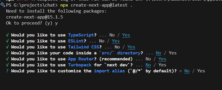
1-Next 설치
npx create-next-app@latest .
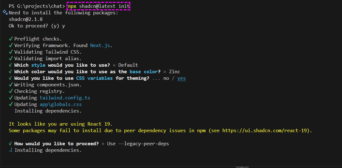
2-shadcn 설치
공식홈
shadcn(샤드씨엔) 이란? ShadCN은 미리 제작된 UI컴포넌트를 제공하는 라이브러리이다. Next와 연동이 간편하고 Tailwind CSS와의 통합을 지원하여 스타일링을 쉽게 할 수 있다.
https://ui.shadcn.com/docs
https://ui.shadcn.com/docs/installation/next
npx shadcn@latest init
3-다크모드 테마 설치
https://ui.shadcn.com/docs/dark-mode/next
npm install next-themes
2단계의 파일생성후 코드를 복사붙여넣기
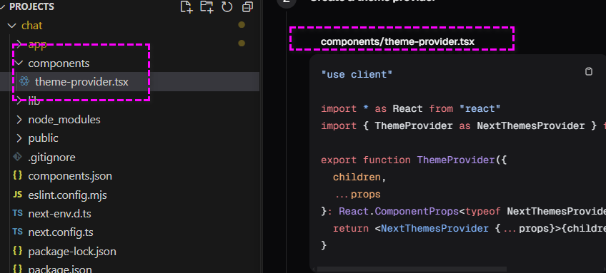
//chat\components\theme-provider.tsx

"use client"

import * as React from "react"
import { ThemeProvider as NextThemesProvider } from "next-themes"

export function ThemeProvider({
  children,
  ...props
}: React.ComponentProps<typeof NextThemesProvider>) {
  return <NextThemesProvider {...props}>{children}</NextThemesProvider>
}
3단계의 소스코드를 복사 붙여넣기 app/layout.tsx
import {ThemeProvider} from '@/components/theme-provider';
import type {Metadata} from 'next';
import {Geist, Geist_Mono} from 'next/font/google';
import './globals.css';

const geistSans = Geist({
  variable: '--font-geist-sans',
  subsets: ['latin'],
});

const geistMono = Geist_Mono({
  variable: '--font-geist-mono',
  subsets: ['latin'],
});

export const metadata: Metadata = {
  title: 'Create Next App',
  description: 'Generated by create next app',
};

export default function RootLayout({
  children,
}: Readonly<{
  children: React.ReactNode;
}>) {
  return (
    <html lang="ko"  suppressHydrationWarning>
      <body className={`${geistSans.variable} ${geistMono.variable} antialiased`}>
        <ThemeProvider attribute="class" defaultTheme="**dark**" enableSystem disableTransitionOnChange>
          {children}
        </ThemeProvider>
      </body>
    </html>
  );
}
4-색상 테마 세팅
- shadcn 메인화면에서 색상 테마를 선택하고 변수를 생성한다
- 우리의 프로젝트에 생성한 변수를 복사하여 덮어씌운다
**/*app/global.css*/**
...
@layer base {
  :root {
    --background: 0 0% 100%;
    --foreground: 222.2 84% 4.9%;
    --card: 0 0% 100%;
    --card-foreground: 222.2 84% 4.9%;
    --popover: 0 0% 100%;
    --popover-foreground: 222.2 84% 4.9%;
    --primary: 221.2 83.2% 53.3%;
    --primary-foreground: 210 40% 98%;
    --secondary: 210 40% 96.1%;
    --secondary-foreground: 222.2 47.4% 11.2%;
    --muted: 210 40% 96.1%;
    --muted-foreground: 215.4 16.3% 46.9%;
    --accent: 210 40% 96.1%;
    --accent-foreground: 222.2 47.4% 11.2%;
    --destructive: 0 84.2% 60.2%;
    --destructive-foreground: 210 40% 98%;
    --border: 214.3 31.8% 91.4%;
    --input: 214.3 31.8% 91.4%;
    --ring: 221.2 83.2% 53.3%;
    --radius: 1rem;
    --chart-1: 12 76% 61%;
    --chart-2: 173 58% 39%;
    --chart-3: 197 37% 24%;
    --chart-4: 43 74% 66%;
    --chart-5: 27 87% 67%;
  }

  .dark {
    --background: 222.2 84% 4.9%;
    --foreground: 210 40% 98%;
    --card: 222.2 84% 4.9%;
    --card-foreground: 210 40% 98%;
    --popover: 222.2 84% 4.9%;
    --popover-foreground: 210 40% 98%;
    --primary: 217.2 91.2% 59.8%;
    --primary-foreground: 222.2 47.4% 11.2%;
    --secondary: 217.2 32.6% 17.5%;
    --secondary-foreground: 210 40% 98%;
    --muted: 217.2 32.6% 17.5%;
    --muted-foreground: 215 20.2% 65.1%;
    --accent: 217.2 32.6% 17.5%;
    --accent-foreground: 210 40% 98%;
    --destructive: 0 62.8% 30.6%;
    --destructive-foreground: 210 40% 98%;
    --border: 217.2 32.6% 17.5%;
    --input: 217.2 32.6% 17.5%;
    --ring: 224.3 76.3% 48%;
    --chart-1: 220 70% 50%;
    --chart-2: 160 60% 45%;
    --chart-3: 30 80% 55%;
    --chart-4: 280 65% 60%;
    --chart-5: 340 75% 55%;
  }
}
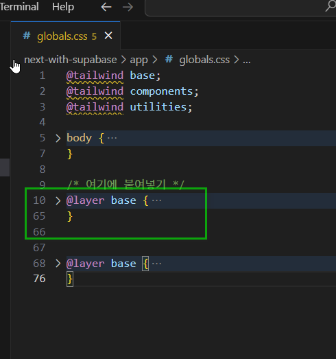
원래 작성되어 있던 코드를 삭제하고 새로운 색상 변수를 덮어 씌운다
5-shadnc ui 적용확인
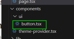
- https://ui.shadcn.com/docs/components/button
- 공식문서를 참조하여 버튼을 설치한다.
npx shadcn@latest add button
- 아래 이미지와 같은 파일이 생성 되었는지 확인한다.
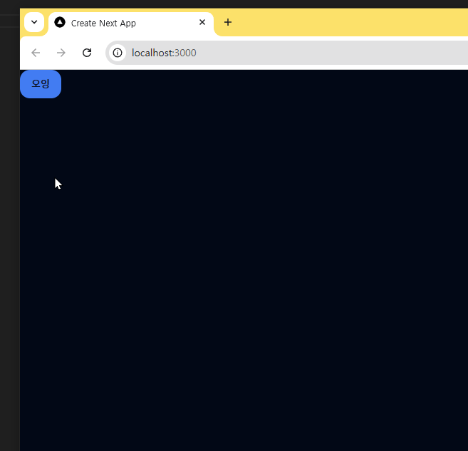
- next-with-supabase\app\page.tsx 를 수정한다.
import { Button } from '@/components/ui/button';
import React from 'react';

const page = () => {
  return (
    <>
      <Button>오잉</Button>
    </>
  );
};
export default page;
- 실행화면
6-auth 만들기
6-1-page.tsx
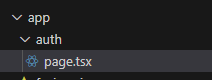
- next-with-supabase\app\auth\page.tsx 파일생성
- 코드작성
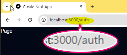
import React from 'react';

const Page = () => {
  return (
    <>
      <div>Page</div>
    </>
  );
};
export default Page;
- 브라우저에서 확인
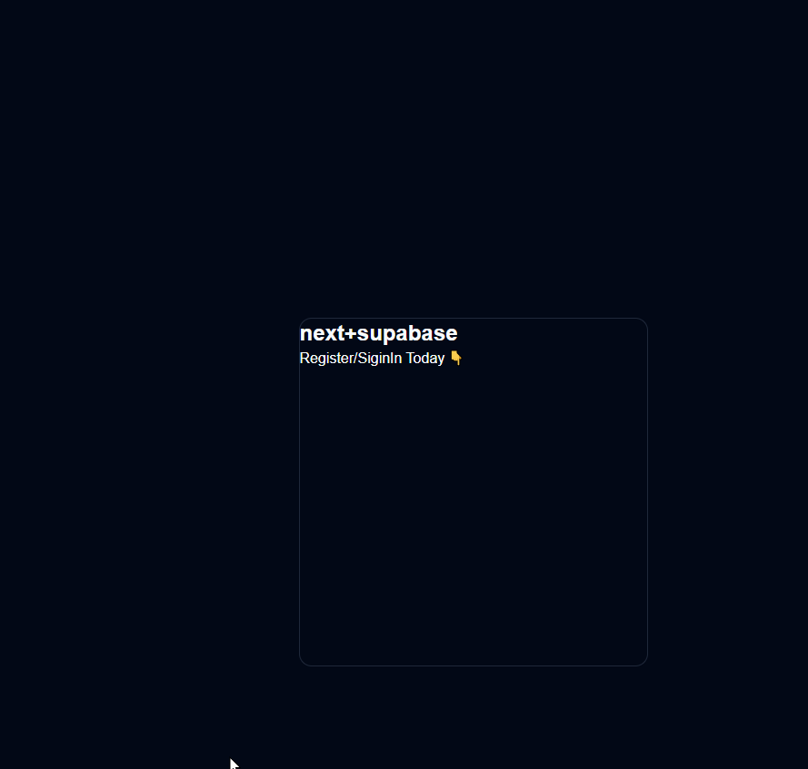
- 이어서 코드 작성
import React from 'react';

const Page = () => {
  return (
    <div className="flex items-center justify-center w-full h-screen">
      <div className="w-96  rounded-md border p-5">
        <h1 className="text-2xl font-bold">next+supabase</h1>
        <p>Register/SiginIn Today 👇</p>
      </div>
    </div>
  );
};
export default Page;
- 여기까지 실행화면
6-2-루시드
- lucide에서 아이콘 적용하기 https://lucide.dev/
- 인스톨 https://lucide.dev/guide/packages/lucide-react
npm install lucide-react
- 아이콘 고르기 https://lucide.dev/icons/
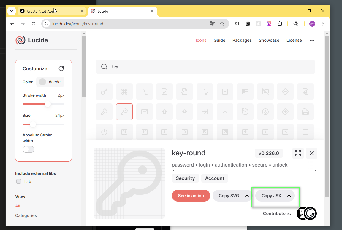
- 아이콘 컴포넌트 적용 next-with-supabase\app\auth\page.tsx
import React from 'react';
**import {KeyRound} from 'lucide-react';**

const Page = () => {
  return (
    <div className="flex items-center justify-center w-full h-screen">
      <div className="w-96 rounded-md border p-5 space-y-5">
**        <div className="flex items-center gap-2">
          <KeyRound color="#dedede" />
**          <h1 className="text-2xl font-bold">next+supabase</h1>
**        </div>**
        <p className='text-sm text-gray-300'>Register/SiginIn Today 👇</p>
      </div>
    </div>
  );
};
export default Page;
7-버튼추가
React-icons 사용
https://react-icons.github.io/react-icons/
- 설치
npm install react-icons --save
- 아이콘 검색
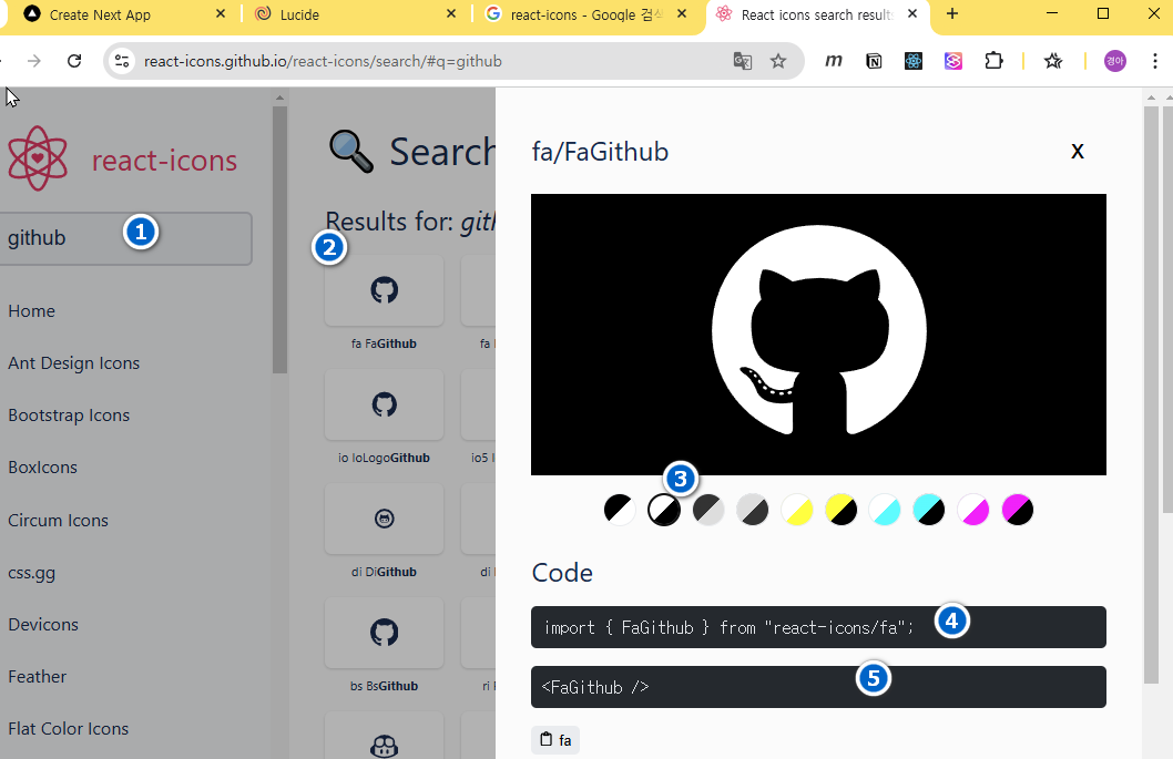
- 코드작성
import {FaGithub} from 'react-icons/fa';
import {AiFillGoogleCircle} from 'react-icons/ai';
...
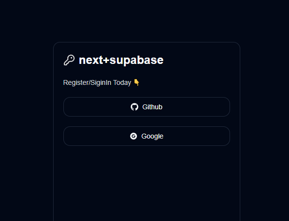
<p className='text-sm text-gray-300'>Register/SiginIn Today 👇</p>
<div className="flex flex-col gap-5">
<Button className="w-full" variant="outline">
<FaGithub />
Github
</Button>
<Button className="w-full" variant="outline">
<AiFillGoogleCircle />
Google
</Button>
</div>
...
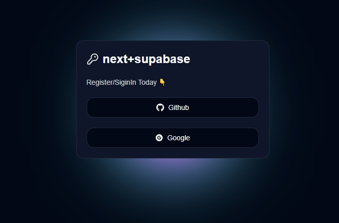
- 화면
7-glowBox 추가
- css 복사
.glowBox{
  position: absolute;
  top: calc(50% - 20px);
  left: calc(50% - 20px);
  width: 40px;
  height: 40px;
  border-radius: 50%;
  background-color: #fff;
  box-shadow:
    0 0 60px 30px #fff,
    0 0 100px 60px #f0f,
    0 0 140px 90px #0ff;
}
- global.css 붙여넣기 next-with-supabase\app\globals.css
.glowBox {
  position: absolute;
  top: calc(50% - 20px);
  left: calc(50% - 20px);
  width: 40px;
  height: 40px;
  border-radius: 50%;
  background-color: #fff;
  box-shadow:
    0 0 60px 30px #fff,
    0 0 100px 60px #f0f,
    0 0 140px 90px #0ff;
}
- class 추가 next-with-supabase\app\auth\page.tsx
...
    <div className="flex items-center justify-center w-full h-screen">
      <div className="w-96 rounded-md border p-5 space-y-5** relative  bg-slate-900"**">
        <div className="flex items-center gap-2">
          <KeyRound color="#dedede" />
          <h1 className="text-2xl font-bold">next+supabase</h1>
        </div>
        <p className="text-sm text-gray-300">Register/SiginIn Today 👇</p>

        <div className="flex flex-col gap-5">
          <Button className="w-full" variant="outline">
            <FaGithub />
            Github
          </Button>
          <Button className="w-full" variant="outline">
            <AiFillGoogleCircle />
            Google
          </Button>
        </div>
**        <div className="glowBox  -z-10"></div>**
      </div>
    </div>
    ...
- 실행화면