5. 배경
본 문서는 웹 페이지의 시각적 완성도를 높이는 핵심 CSS 속성인 불투명도(opacity)와 배경(background) 설정 방법을 다룬다. 기본적인 색상 및 이미지 적용부터 반복, 위치, 크기 제어, 그리고 복합적인 레이어링을 가능하게 하는 다중 배경 기법을 학습한다.
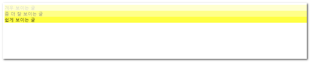
01. opacity
설명
요소 전체의 불투명도를 설정한다. 배경색뿐만 아니라 자식 요소와 텍스트 등 모든 콘텐츠의 투명도에 영향을 미친다.
| 값 | 설명 |
|---|---|
0 ~ 1 | 0은 완전 투명, 1은 완전 불투명 (예: 0.5는 반투명) |
배경색만 투명하게 하려면
rgba()나hsla()를 사용해야 한다. 자식 요소가 부모의opacity를 무시할 수 없다.
시작 ex2-39-1.html
<!DOCTYPE html>
<html lang="ko">
<head>
<meta charset="utf-8">
<title>opacity</title>
<style type = "text/css">

</style>
</head>
<body>
		<div class="light">겨우 보이는 글</div>
		<div class="medium">좀 더 잘 보이는 글</div>
		<div class="heavy">쉽게 보이는 글</div>
</body>
</html>
완료 ex2-39-1.html
<!DOCTYPE html>
<html lang="ko">
  <head>
    <meta charset="UTF-8" />
    <meta http-equiv="X-UA-Compatible" content="IE=edge" />
    <meta name="viewport" content="width=device-width, initial-scale=1.0" />
    <title>Document</title>
  </head>
  <body>
    <!DOCTYPE html>
    <html lang="ko">
      <head>
        <meta charset="utf-8" />
        <title>opacity</title>
        <style type="text/css">
          body {
            background-image: url(img/bg_grid.gif);
          }
          div {
            background-color: yellow;
          }
          .light {
            opacity: 0.2;
          }
          .medium {
           background-color: rgba(255,255,0,0.2);
          }
          .heavy {
            opacity: 0.9;
          }
        </style>
      </head>
      <body>
        <div class="light">겨우 보이는 글</div>
        <div class="medium">좀 더 잘 보이는 글</div>
        <div class="heavy">쉽게 보이는 글</div>
      </body>
    </html>
  </body>
</html>
02. background
설명
배경과 관련된 여러 속성(color, image, repeat, attachment, position 등)을 한 번에 선언할 수 있는 축약 속성이다.
| 속성 | 설명 |
|---|---|
background-attachment | 배경 이미지의 스크롤 여부 설정 |
background-clip | 배경이 그려지는 영역 설정 |
background-color | 배경 색상 설정 |
background-image | 배경 이미지 설정 |
background-origin | 배경 이미지의 기준 위치 설정 |
background-position | 배경 이미지의 초기 위치 설정 |
background-repeat | 배경 이미지의 반복 방식 설정 |
background-size | 배경 이미지의 크기 설정 |
개별 속성을 선언하기 전에
background축약 속성으로 전체를 리셋(초기화)하는 패턴이 자주 쓰인다. 자세한 내용은 🔗MDN 참고.
위 속성의 초기값
| 속성 | 초기값 |
|---|---|
background-image | none |
background-position | 0% 0% |
background-size | auto auto |
background-repeat | repeat |
background-origin | padding-box |
background-clip | border-box |
background-attachment | scroll |
background-color | transparent |
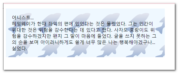
03. background-color, background-image
설명
단일 요소에 배경색과 배경 이미지를 동시에 지정할 수 있다. 이미지가 로드되지 않거나 투명한 영역이 있을 때 배경색이 표시된다.
| 값 | 설명 |
|---|---|
color | 유효한 CSS 색상 값 |
url('경로') | 배경으로 사용할 이미지의 경로 |
이미지와 색상을 함께 선언하면 이미지가 항상 색상 위에(앞에) 렌더링된다.
시작 ex2-39.html
<!DOCTYPE html>
<html lang="ko">
<head>
<meta charset="utf-8">
<title>배경이미지</title>
<style type="text/css">

</style>
</head>
<body>
    <p>
        어니스트... <br>
        헤밍웨이가 한때 좌익의 편에 있었다는 것은 몰랐었다. 그는 인간이 위대한 것은 위험을 감수한다는 데 있다고 했다. 사자도 호랑이도 위험을 감수하겠지만 왠지 그 말이 마음에 들었다. 글을 쓰지 못하는 그의 손을 보며 아이러니하게도 쓸게 너무 많은 나는 행복해야겠구나... 싶었다.
    </p>
</body>
</html>
완료 ex2-39.html
<!DOCTYPE html>
<html lang="ko">
  <head>
    <meta charset="utf-8" />
    <title>배경이미지</title>
    <style type="text/css">
      p {
        width:500px;
        padding:20px;
        background-color: aliceblue;
        background-image: url('img/bgimg.png');
      }
    </style>
  </head>
  <body>
    <p>
      어니스트... <br />
      헤밍웨이가 한때 좌익의 편에 있었다는 것은 몰랐었다. 그는 인간이 위대한
      것은 위험을 감수한다는 데 있다고 했다. 사자도 호랑이도 위험을 감수하겠지만
      왠지 그 말이 마음에 들었다. 글을 쓰지 못하는 그의 손을 보며 아이러니하게도
      쓸게 너무 많은 나는 행복해야겠구나... 싶었다.
    </p>
    <p></p>
  </body>
</html>
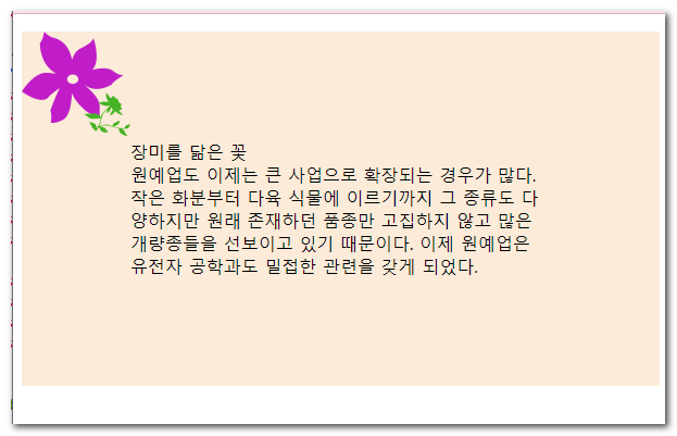
04. background-repeat
설명
배경 이미지가 요소의 크기보다 작을 때 어떻게 반복될지 설정한다.
| 값 | 설명 |
|---|---|
repeat | 기본값. 수평 및 수직 방향으로 모두 반복 |
repeat-x | 수평 방향으로만 반복 |
repeat-y | 수직 방향으로만 반복 |
no-repeat | 반복하지 않음 (한 번만 표시) |
space / round | 여백을 두거나 크기를 조절하여 잘리지 않게 반복 |
아이콘이나 특정 위치의 장식용 이미지를 넣을 때는 주로
no-repeat을 사용한다.
시작 ex2-40.html
<!DOCTYPE html>
<html lang="ko">
<head>
<meta charset="utf-8">
<title>배경이미지의 반복여부</title>
<style type="text/css">

</style>
</head>
<body>
    <p>
        장미를 닮은 꽃<br>
        원예업도 이제는 큰 사업으로 확장되는 경우가 많다. 작은 화분부터 다육 식물에 이르기까지 그 종류도 다양하지만 원래 존재하던 품종만 고집하지 않고 많은 개량종들을 선보이고 있기 때문이다. 이제 원예업은 유전자 공학과도 밀접한 관련을 갖게 되었다.
    </p>
</body>
</html>
완료 ex2-40.html
<!DOCTYPE html>
<html lang="ko">
  <head>
    <meta charset="utf-8" />
    <title>배경이미지의 반복여부</title>
    <style type="text/css">
      p {
        padding:100px;
        background-color: antiquewhite;
        background-image: url(img/bg_flower.png);
        background-repeat: no-repeat;
      }
    </style>
  </head>
  <body>
    <p>
      장미를 닮은 꽃<br />김경아 원예업도 이제는 큰 사업으로 확장되는 경우가
      많다. 작은 화분부터 다육 식물에 이르기까지 그 종류도 다양하지만 원래
      존재하던 품종만 고집하지 않고 많은 개량종들을 선보이고 있기 때문이다. 이제
      원예업은 유전자 공학과도 밀접한 관련을 갖게 되었다.
    </p>
  </body>
</html>
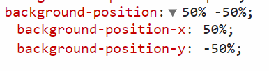
05. background-position
설명
배경 이미지의 초기 시작 위치를 지정한다. 키워드, 백분율(%), 길이(px 등) 단위를 조합하여 x축(가로)과 y축(세로) 위치를 정한다.
| 값 | 설명 |
|---|---|
키워드 | left, right, top, bottom, center |
길이 / % | 0 0(좌상단), 50% 50%(중앙 정렬), 10px 20px |
값이 하나만 주어지면 두 번째 값은 기본적으로
center(또는 50%)로 간주된다. 첫번째 숫자 → x, 두번째 숫자 → y.
시작 ex2-41.html
<!DOCTYPE html>
<html lang="ko">
<head>
<meta charset="utf-8">
<title>배경이미지의 위치</title>
<style type="text/css">
</style>
</head>
<body>
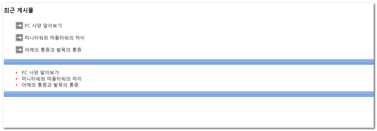
<h3>최근 게시물</h3>
<ul>
<li>PC 사양 알아보기</li>
<li>미니타워와 미들타워의 차이</li>
<li>어깨의 통증과 발목의 통증</li>
</ul>
<ul>
<li>PC 사양 알아보기</li>
<li>미니타워와 미들타워의 차이</li>
<li>어깨의 통증과 발목의 통증</li>
</ul>
</body>
</html>
완료 ex2-41.html
<!DOCTYPE html>
<html lang="ko">

<head>
  <meta charset="UTF-8">
  <meta name="viewport" content="width=device-width, initial-scale=1.0">
  <title>Document</title>
  <style>
    body{
      background-image: url('./img/bg_linepttn.png'), url('./img/bg_ar.png');
      background-repeat: no-repeat;
      background-repeat: repeat-y;
      background-position: 0 100%, 100% 0%;
    }
    ul {
      list-style: none;
    }

    .pc1 li {
      background-image: url('./img/bg_ar.png');
      background-repeat: no-repeat;
      background-position-y: 50%;
      background-position-x: 0%;
      padding: 20px;
      text-indent: 20px;
    }

    .pc1,
    .pc2 {
      background-image: url('./img/bg_linepttn.png');
      background-repeat: repeat-x;
      background-position: 0 100%;
    }

    .pc2 li {
      background-image: url('./img/bg_bullet.png');
      background-repeat: no-repeat;
      background-position: 0 50%;
      background-position: left 50%;
      background-position: left center;
      background-position: right bottom;
      padding: 20px;
      text-indent: 20px;
    }
  </style>
</head>

<body>
  <h1>background-position</h1>
  <h3>최근 게시물</h3>
  <ul class="pc1">
    <li>PC 사양 알아보기</li>
    <li>미니타워와 미들타워의 차이</li>
    <li>어깨의 통증과 발목의 통증</li>
  </ul>
  <ul class="pc2">
    <li>PC 사양 알아보기</li>
    <li>미니타워와 미들타워의 차이</li>
    <li>어깨의 통증과 발목의 통증</li>
  </ul>
</body>

</html>
06. background-attachment
설명
배경 이미지가 화면을 스크롤할 때 콘텐츠와 함께 스크롤될지, 아니면 뷰포트(또는 요소)에 고정될지 결정한다. 패럴랙스(Parallax) 스크롤링 효과를 낼 때 자주 사용된다.
| 값 | 설명 |
|---|---|
scroll | 기본값. 배경이 요소 자체를 기준으로 고정되며, 페이지 스크롤 시 함께 이동 |
fixed | 배경이 뷰포트(브라우저 창)를 기준으로 고정. 페이지를 스크롤해도 움직이지 않음 |
local | 배경이 요소의 콘텐츠에 고정되어, 요소 내부를 스크롤할 때 함께 이동 |
모바일 기기(iOS 등)에서는
fixed속성이 성능 문제로 인해 정상적으로 작동하지 않거나 무시되는 경우가 많으므로 주의가 필요하다.
시작 ex2-42.html
<!DOCTYPE html>
<html lang="ko">
<head>
<meta charset="utf-8">
<title>배경이미지 고정</title>
<style type="text/css">
</style>
</head>
<body>
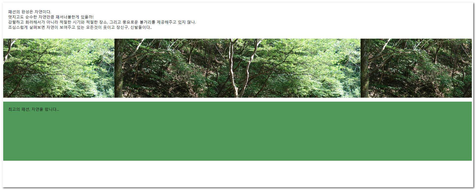
<p>패션의 완성은 자연이다.<br>멋지고도 순수한 자연만큼 패셔너블한게 있을까! <br>강렬하고 화려해서가 아니라 적절한 시기와 적절한 장소, 그리고 풍요로운 볼거리를 제공해주고 있지 않나.<br>
조심스럽게 살펴보면 자연이 보여주고 있는 모든것이 옷이고 장신구, 신발들이다..</p>
<p class="bg_fixed"></p>
<p class="btm">최고의 패션, 자연을 팝니다... </p>
</body>
</html>
완료 ex2-42.html
<!DOCTYPE html>
<html lang="ko">
<head>
<meta charset="utf-8">
<title>배경이미지 고정</title>
<style type="text/css">
    p { padding: 20px; }
    .bg_fixed {
        min-height: 200px;
        background-image: url(img/bg_fixed.png);
        background-position: center;
        background-attachment:fixed;
    }
    .btm {
        min-height:200px;
        background: #595;
    }
</style>
</head>
<body>
    <p>패션의 완성은 자연이다.<br>멋지고도 순수한 자연만큼 패셔너블한게 있을까! <br>강렬하고 화려해서가 아니라 적절한 시기와 적절한 장소, 그리고 풍요로운 볼거리를 제공해주고 있지 않나.<br>
    조심스럽게 살펴보면 자연이 보여주고 있는 모든것이 옷이고 장신구, 신발들이다..</p>
    <p class="bg_fixed"></p>
    <p class="btm">최고의 패션, 자연을 팝니다... </p>
</body>
</html>
07. background-size
설명
배경 이미지의 출력 크기를 지정한다. 이미지의 원래 크기를 유지하거나 비율을 맞춰 요소를 덮도록 조절할 수 있다.
| 값 | 설명 |
|---|---|
auto | 원본 크기 유지 (기본값) |
길이 / % | 지정한 크기 또는 요소 크기 대비 백분율 (너비 높이 순서) |
cover | 비율을 유지하며 요소를 완전히 덮음 (잘릴 수 있음) |
contain | 비율을 유지하며 요소 안에 온전히 들어감 (여백이 생길 수 있음) |
반응형 웹 디자인에서 전체 화면 배경을 구현할 때
background-size: cover가 핵심적인 역할을 한다.
시작 ex2-43.html
<!DOCTYPE html>
<html lang="ko">
<head>
<meta charset="utf-8">
<title>배경이미지의 크기</title>
<style type="text/css">

</style>
</head>
<body>
    <div class="who who1"></div>
    <div class="who who2"></div>
    <div class="who who3"></div>
    <div class="who who4"></div>
    <div class="who who5"></div>
</body>
</html>
완료 ex2-43.html
<!DOCTYPE html>
<html lang="ko">
  <head>
    <meta charset="utf-8" />
    <title>배경이미지의 크기</title>
    <style type="text/css">
      .who {
        height: 150px;
        margin-bottom: 10px;
        background: #67758e url("img/bg_size.png") no-repeat;
      }
      /* width height */
      .who1 {
        background-size: 100px 200px;
        background-position: center;
      }
      .who2 {
        /* 하나만 쓰면 width에 적용 height는 자동 */
        background-size: 50px;
      }
      .who3 {
        background-size: 80% 150%;
      }
      .who4 {
        /* cover 식탁커버 */
        background-size: cover;
      }
      .who5 {
        height:500px;
        /* 컨테이너 */
        background-size: contain;
      }
    </style>
  </head>
  <body>
    <div class="who who1"></div>
    <div class="who who2"></div>
    <div class="who who3"></div>
    <div class="who who4"></div>
    <div class="who who5"></div>
  </body>
</html>
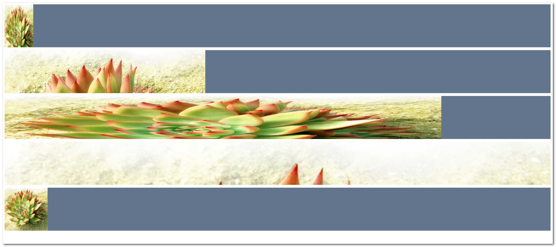
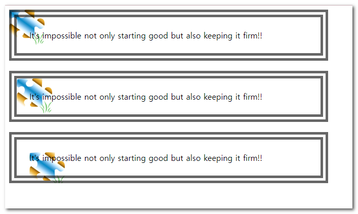
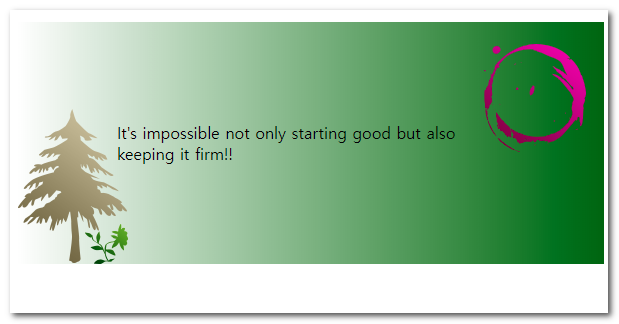
08. background-origin
설명
배경 이미지의 렌더링이 시작되는 기준 영역(원점)을 지정한다. box-sizing과 유사한 영역 개념을 사용한다.
| 값 | 설명 |
|---|---|
padding-box | 기본값. 테두리 안쪽(패딩 영역 포함)부터 배경 시작 |
border-box | 테두리 영역부터 배경 시작 (테두리 아래로 이미지가 깔림) |
content-box | 콘텐츠 영역(패딩 안쪽)부터 배경 시작 |
이 속성은
background-attachment가fixed인 경우에는 무시된다.
시작 ex2-44.html
<!DOCTYPE html>
<html lang="ko">
<head>
<meta charset="utf-8">
<title>배경이미지의 원점</title>
<style type="text/css">

</style>
</head>
<body>
    <div class="ori1">It's impossible not only starting good but also keeping it firm!!</div>
    <div class="ori2">It's impossible not only starting good but also keeping it firm!!</div>
    <div class="ori3">It's impossible not only starting good but also keeping it firm!!</div>
</body>
</html>
완료 ex2-44.html
<!DOCTYPE html>
<html lang="ko">
  <head>
    <meta charset="utf-8" />
    <title>배경이미지의 원점</title>
    <style type="text/css">
      div{
        width:550px;
        padding:25px;
        margin-bottom: 20px;
        border:15px double rgba(0,0,0,.6);
        background: url('img/bg_origin.png') no-repeat ;
        background-size: 70px;
      }
      .ori1{background-origin: border-box;}
      .ori2{background-origin: padding-box;}
      .ori3{background-origin: content-box;}
    </style>
  </head>
  <body>
    <div class="ori1">
      It's impossible not only starting good but also keeping it firm!!
    </div>
    <div class="ori2">
      It's impossible not only starting good but also keeping it firm!!
    </div>
    <div class="ori3">
      It's impossible not only starting good but also keeping it firm!!
    </div>
  </body>
</html>
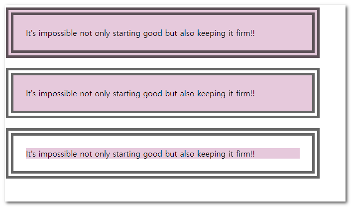
09. background-clip
설명
요소의 배경(색상 또는 이미지)이 렌더링될 실제 영역을 자르는(clip) 속성이다. background-origin과 값은 같지만 적용 방식이 다르다.
| 값 | 설명 |
|---|---|
border-box | 기본값. 테두리 영역의 바깥쪽 가장자리까지 배경 표시 |
padding-box | 패딩 영역의 바깥쪽 가장자리까지 배경 표시 (테두리엔 배경 없음) |
content-box | 콘텐츠 영역에만 배경 표시 (패딩과 테두리엔 배경 없음) |
text | 텍스트의 형태(전경)로 배경을 클리핑. 투명 글자와 조합하여 텍스트에 이미지를 입힘 |
텍스트에 배경을 입히는
background-clip: text는 벤더 프리픽스(-webkit-)가 필요한 경우가 많다.
시작 ex2-45.html
<!DOCTYPE html>
<html lang="ko">
<head>
<meta charset="utf-8">
<title>배경이미지의 영역</title>
<style type="text/css">

</style>
</head>
<body>
    <div class="clip1">It's impossible not only starting good but also keeping it firm!!</div>
    <div class="clip2">It's impossible not only starting good but also keeping it firm!!</div>
    <div class="clip3">It's impossible not only starting good but also keeping it firm!!</div>
</body>
</html>
완료 ex2-45.html
<!DOCTYPE html>
<html lang="ko">
<head>
<meta charset="utf-8">
<title>배경이미지의 영역</title>
<style type="text/css">
  div{
    width: 550px;
    border: brown 15px double;
    margin-bottom: 20px;
    padding:25px;
    background-color: aquamarine;
  }
  .clip1{background-clip: border-box;}
  .clip2{background-clip: padding-box;}
  .clip3{background-clip: content-box;}
</style>
</head>
<body>
    <div class="clip1">It's impossible not only starting good but also keeping it firm!!</div>
    <div class="clip2">It's impossible not only starting good but also keeping it firm!!</div>
    <div class="clip3">It's impossible not only starting good but also hopping it firm!!</div>
</body>
</html>
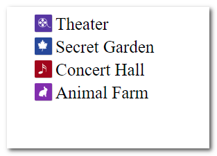
10. sprite image
설명
웹 페이지의 성능 향상을 위해 여러 개의 작은 이미지를 하나의 큰 이미지 파일(스프라이트 시트)로 병합한 후, background-position을 조절하여 원하는 부분만 보여주는 기법이다.
| 값 | 설명 |
|---|---|
background-image | 공통 스프라이트 시트 이미지 선언 |
background-position | 스프라이트 내에서 보여줄 개별 아이콘의 좌표 이동 |
브라우저의 HTTP 요청 횟수를 줄여 로딩 속도를 크게 개선할 수 있어 실무에서 널리 쓰이는 최적화 기법이다.
시작 ex2-46.html
<!DOCTYPE html>
<html lang="ko">
<head>
<meta charset="utf-8">
<title>IMAGE SPRITE</title>
<style type="text/css">

</style>
</head>
<body>
    <ul class="lnb">
        <li><a href="#">Theater</a></li>
        <li><a href="#">Secret Garden</a></li>
        <li><a href="#">Concert Hall</a></li>
        <li><a href="#">Animal Farm</a></li>
    </ul>
</body>
</html>
완료 ex2-46.html
<!DOCTYPE html>
<html lang="ko">
  <head>
    <meta charset="utf-8" />
    <title>IMAGE SPRITE</title>
    <style type="text/css">
      li {
        list-style: none;
        margin:5px;
      }
      li a {
        text-decoration: none;
        font-family: "Times New Roman", Times, serif;
        color:#333;
        display: block;
        padding-left:30px;
        background: #999;
        background: url('img/bg_sprite.png') no-repeat;
        background-size: 26px;
        font-size: 25px;
      }
      .lnb li:nth-child(1) a{background-position: 0 0;}
      .lnb li:nth-child(2) a{background-position: 0 -50px;}
      .lnb li:nth-child(3) a{background-position: 0 -100px;}
      .lnb li:nth-child(4) a{background-position: 0 -150px;}
    </style>
  </head>
  <body>
    <ul class="lnb">
      <li><a href="#">Theater</a></li>
      <li><a href="#">Secret Garden</a></li>
      <li><a href="#">Concert Hall</a></li>
      <li><a href="#">Animal Farm</a></li>
    </ul>
  </body>
</html>
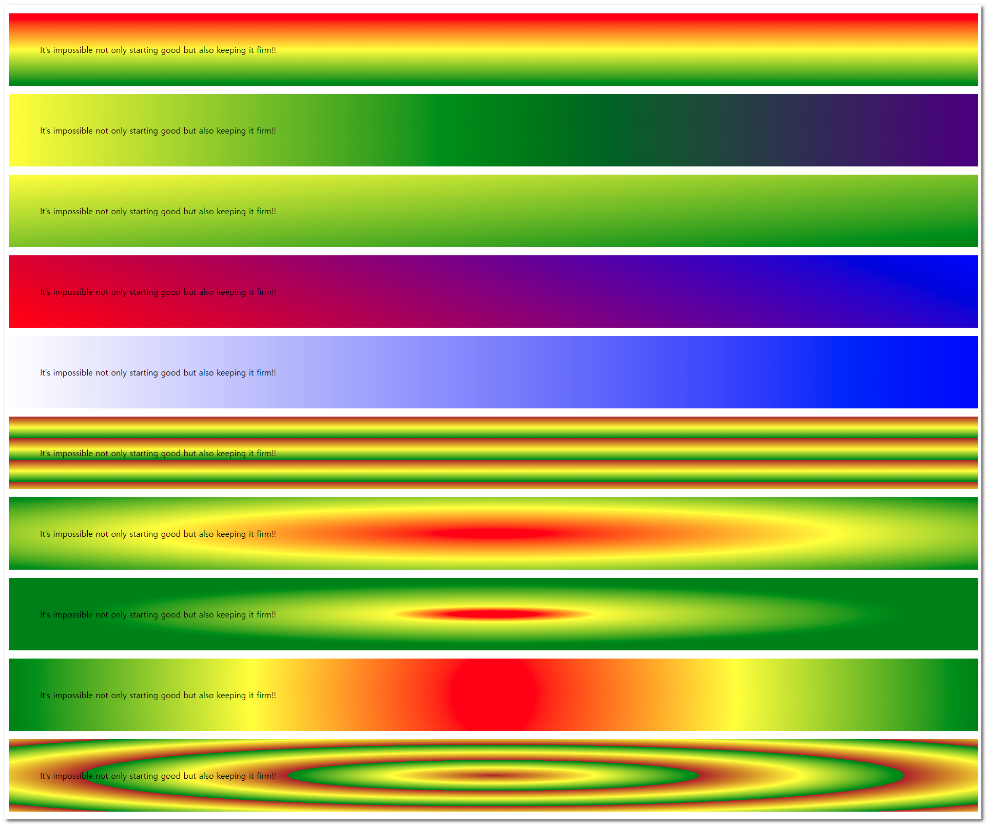
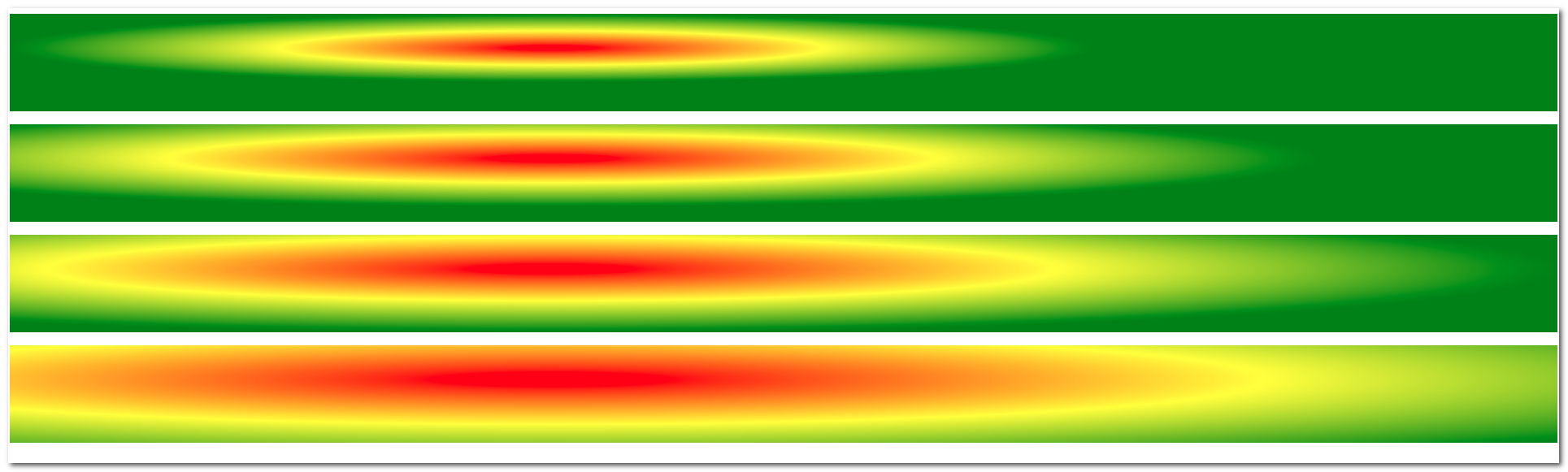
11. gradient
설명
두 가지 이상의 색상이 점진적으로 부드럽게 변하는 효과를 생성한다. 이미지 대신 CSS만으로 그레이디언트를 만들어 background-image 속성에 적용한다.
| 값 | 설명 |
|---|---|
linear-gradient() | 선형 그레이디언트. 지정된 각도나 방향을 따라 색상이 변함 |
radial-gradient() | 원형/타원형 그레이디언트. 중심점에서 바깥쪽으로 색상이 퍼짐 |
repeating-... | 그레이디언트 패턴을 반복하여 채움 |
구형 브라우저 호환성을 위해 벤더 프리픽스(
-webkit-,-moz-등)를 함께 사용하는 경우가 있다.
시작 ex2-47.html
<!DOCTYPE html>
<html lang="ko">
<head>
<meta charset="utf-8">
<title>gradient의 표현</title>
<style type="text/css">


</style>
</head>
<body>
    <p class="g1">It's impossible not only starting good but also keeping it firm!!</p>
    <p class="g2">It's impossible not only starting good but also keeping it firm!!</p>
    <p class="g3">It's impossible not only starting good but also keeping it firm!!</p>
    <p class="g4">It's impossible not only starting good but also keeping it firm!!</p>
    <p class="g5">It's impossible not only starting good but also keeping it firm!!</p>
    <p class="g6">It's impossible not only starting good but also keeping it firm!!</p>
    <p class="g7">It's impossible not only starting good but also keeping it firm!!</p>
    <p class="g8">It's impossible not only starting good but also keeping it firm!!</p>
    <p class="g9">It's impossible not only starting good but also keeping it firm!!</p>
    <p class="g10">It's impossible not only starting good but also keeping it firm!!</p>
</body>
</html>
완료 ex2-47.html
<!DOCTYPE html>
<html lang="ko">
  <head>
    <meta charset="utf-8" />
    <title>gradient의 표현</title>
    <style type="text/css">
      p {
        padding: 60px;
      }
      .g1 {
        background: red;
        background: linear-gradient(red, yellow, green);
      }
      .g2 {
        background: linear-gradient(to right, red, yellow, purple, green);
      }
      .g3 {
        background: linear-gradient(to bottom right, red, yellow, green);
      }
      .g4 {
        background: linear-gradient(-200deg, red, yellow, green);
      }
      .g5 {
        background: linear-gradient(
          to right,
          rgba(0, 0, 255, 0),
          rgba(0, 0, 255, 0.8)
        );
      }
      .g6 {
        background: repeating-linear-gradient(brown, yellow 15%, green 30%);
      }
      .g7 {
        background: radial-gradient(red, yellow, green);
      }
      .g8 {
        background: radial-gradient(red 5%, yellow 15%, green 60%);
        background: radial-gradient(
          closest-side at 35% 35%,
          red 5%,
          yellow 15%,
          green 60%
        );
      }
      .g9 {
        background: radial-gradient(
          circle,
          red,
          rgba(0, 0, 255, 0),
          rgba(0, 0, 255, 0.8)
        );
      }
      .g10 {
        /* colorzilla generator */
        background: #e52d77;
        /* vendor prefix
          실험적인 기술을 브라우저에서 사용하기 위한 접두어
          -webkit- : 크롬, 사파리 , 엣지
          -o-  : 오페라
          -moz- :  파이어폭스
          -ms- : 익스
        */
        background: -moz-linear-gradient(
          left,
          #e52d77 0%,
          #6b4711 30%,
          #28d330 51%,
          #e82559 61%,
          #c6976b 100%
        );
        background: -webkit-linear-gradient(
          left,
          #e52d77 0%,
          #6b4711 30%,
          #28d330 51%,
          #e82559 61%,
          #c6976b 100%
        );
        background: linear-gradient(
          to right,
          #e52d77 0%,
          #6b4711 30%,
          #28d330 51%,
          #e82559 61%,
          #c6976b 100%
        );
        filter: progid:DXImageTransform.Microsoft.gradient( startColorstr='#e52d77', endColorstr='#c6976b',GradientType=1 );
      }
    </style>
  </head>
  <body>
    <p class="g1">
      It's impossible not only starting good but also keeping it firm!!
    </p>
    <p class="g2">
      It's impossible not only starting good but also keeping it firm!!
    </p>
    <p class="g3">
      It's impossible not only starting good but also keeping it firm!!
    </p>
    <p class="g4">
      It's impossible not only starting good but also keeping it firm!!
    </p>
    <p class="g5">
      It's impossible not only starting good but also keeping it firm!!
    </p>
    <p class="g6">
      It's impossible not only starting good but also keeping it firm!!
    </p>
    <p class="g7">
      It's impossible not only starting good but also keeping it firm!!
    </p>
    <p class="g8">
      It's impossible not only starting good but also keeping it firm!!
    </p>
    <p class="g9">
      It's impossible not only starting good but also keeping it firm!!
    </p>
    <p class="g10">
      It's impossible not only starting good but also keeping it firm!!
    </p>
  </body>
</html>
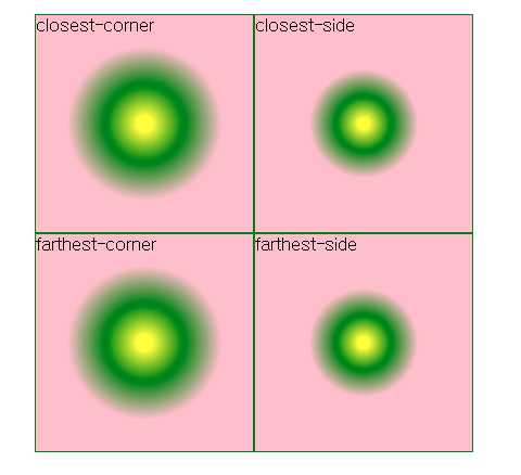
12. radial-gradient
설명
특정 중심점에서 바깥쪽으로 퍼져나가는 원형(circle) 또는 타원형(ellipse) 그레이디언트를 생성한다. 형태, 크기 조절 키워드, 시작점 위치를 세밀하게 제어할 수 있다.
| 값 | 설명 |
|---|---|
closest-side | 그레이디언트 끝 모양이 중앙에서 가장 가까운 변에 닿음 |
closest-corner | 그레이디언트 끝 모양이 중앙에서 가장 가까운 모서리에 닿음 |
farthest-side | 그레이디언트 끝 모양이 중앙에서 가장 먼 변에 닿음 |
farthest-corner | 기본값. 그레이디언트 끝 모양이 중앙에서 가장 먼 모서리에 닿음 |
at x축 y축형태로 중심점의 위치를 %나 px 단위로 임의 변경할 수 있다. 자세한 내용은 🔗MDN 참고.
시작 ex2-48.html
<!DOCTYPE html>
<html lang="ko">
<head>
<meta charset="utf-8">
<title>중심점 변경</title>
<style type="text/css">

</style>
</head>
<body>
    <p class="rg1"></p>
    <p class="rg2"></p>
    <p class="rg3"></p>
    <p class="rg4"></p>
</body>
</html>
완료 ex2-48.html
<!DOCTYPE html>
<html lang="ko">
<head>
<meta charset="utf-8">
<title>중심점 변경</title>
<style type="text/css">
    p { padding: 60px; background: red;}
    .rg1 { background: radial-gradient(closest-side at 35% 35%, red, yellow, green); }
    .rg2 { background: radial-gradient(closest-corner at 35% 35%, red, yellow, green); }
    .rg3 { background: radial-gradient(farthest-side at 35% 35%, red, yellow, green); }
    .rg4 { background: radial-gradient(farthest-corner at 35% 35%, red, yellow, green); }
</style>
</head>
<body>
    <p class="rg1"></p>
    <p class="rg2"></p>
    <p class="rg3"></p>
    <p class="rg4"></p>
</body>
</html>
13. mutiple-background
설명
하나의 요소에 여러 개의 배경 이미지나 그레이디언트를 쉼표로 구분하여 동시에 적용할 수 있다.
| 특징 | 설명 |
|---|---|
| 렌더링 순서 | 먼저 선언된 이미지일수록 화면의 앞쪽(z-index가 높은 것처럼)에 배치됨 |
| 개별 제어 | 각 이미지마다 background-position, background-repeat 등을 쉼표로 구분해 개별 설정 가능 |
다중 배경을 활용하면 HTML 요소를 추가하지 않고도 복잡한 시각적 레이어링을 구현할 수 있다.
시작 ex2-49.html
<!DOCTYPE html>
<html lang="ko">
<head>
<meta charset="utf-8">
<title>다중 배경이미지</title>
<style type="text/css">

</style>
</head>
<body>
    <p>It's impossible not only starting good but also keeping it firm!!</p>
</body>
</html>
완료 ex2-49.html
<!DOCTYPE html>
<html lang="ko">
  <head>
    <meta charset="utf-8" />
    <title>다중 배경이미지</title>
    <style type="text/css">
      p {
        padding: 100px;
        background-image: url(img/bg_tree.png), url(img/bg_sun.png),
          linear-gradient(to right, rgba(0, 100, 0, 0), rgba(0, 100, 0, 1));
        background-repeat: no-repeat, repeat-y;
        background-position: bottom left, 90% 15%;
      }
    </style>
  </head>
  <body>
    <p>It's impossible not only starting good but also keeping it firm!!</p>
  </body>
</html>
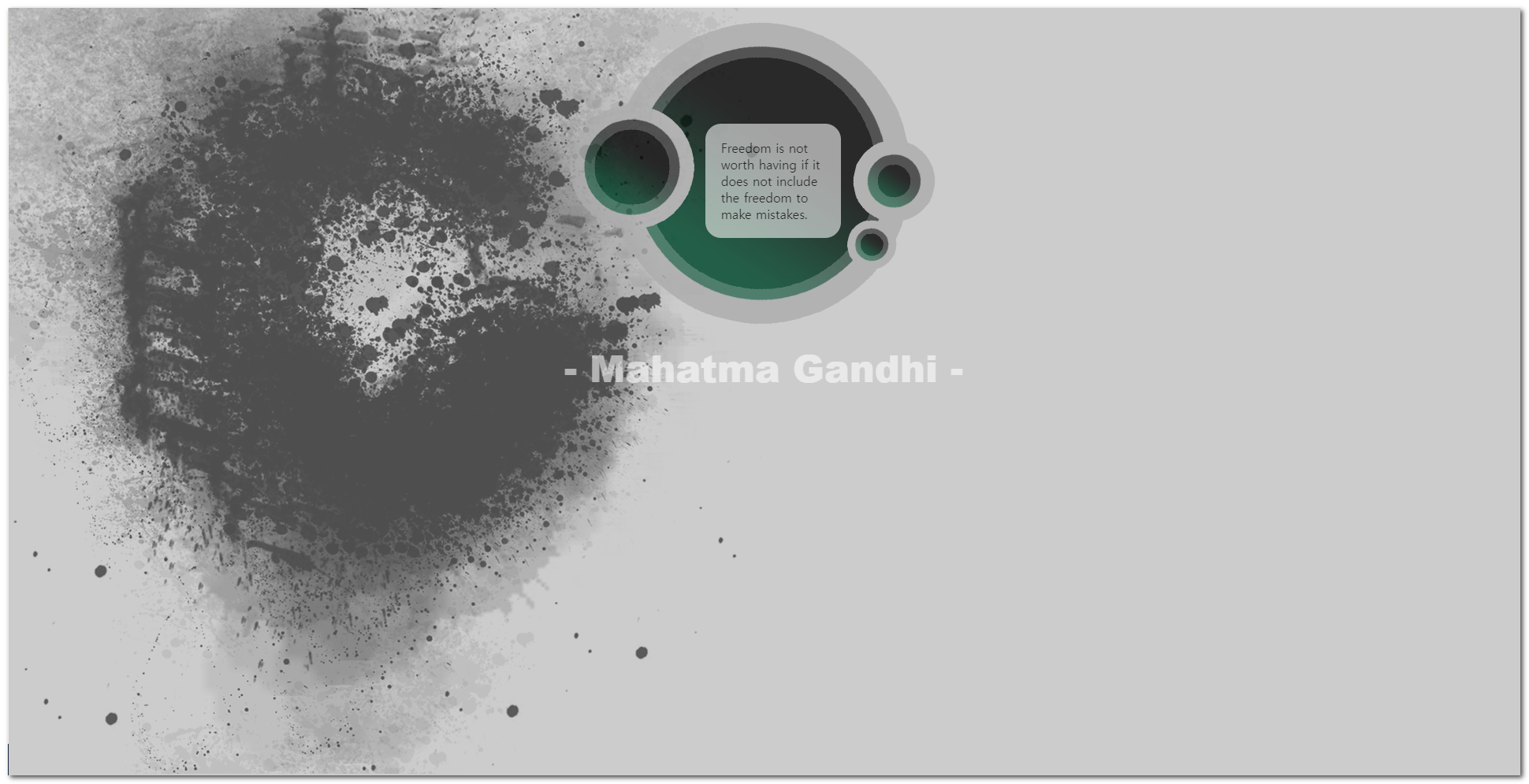
14. 형성퀴즈
설명
앞서 배운 속성들을 종합적으로 활용하여 시안과 동일한 레이아웃과 스타일을 구현하는 실습 문제이다.
| 요구사항 | 설명 |
|---|---|
| 제한사항 | 제공된 HTML 문서는 수정하지 않고 오직 CSS 파일만을 편집할 것 |
| 리소스 | 예제와 동일한 이미지를 활용하여 배경, 불투명도 등을 적용 |
배운 CSS 속성들을 결합하여 실전 퍼블리싱 능력을 기른다.
리소스파일

quiz5.html
<!DOCTYPE HTML>
<html>
	<head>
		<title>이미지, 색상, 글자 투명도 조정하기</title>
		<meta charset="UTF-8" />
		<style type="text/css">
			.textBox{
				border-radius:20px;
				}
		</style>
	</head>

	<body>
		<div>
			<p class="textBox">
					Freedom is not worth having
					if it does not include the freedom to make mistakes.
			</p>
			<p class="people">- Mahatma Gandhi - <p>
		</div>
	</body>
</html>