7. 트랜지션과-애니메이션
1. 트랜지션 (transition)
1. 개요
요소에 두 가지 상태 사이에 변화를 줄 수 있다.
2. 기본문법
transition: <property> <duration> <timing-function> <delay>;
예시: transition: opacity 300ms ease-in;
3. 속성
| 속성 명 | 초기값 | 설명 |
|---|---|---|
| transition-property | all | 트랜지션 속성 |
| transition-duration | Os | 지속시간 |
| transition-timing-function | ease | 속도변화 지정 |
| transition-delay | Os | 시작 전 지연 시간 지정 |
4. 예제
4.1. 호버된 이미지가 확대되서 보여지는 효과
[미리보기]
코드작성
1. html 작성
html
<section class="container">
	<ul>
		<li>
			<div class="content">
				<h2>타이틀</h2>
				<p>Lorem ipsum dolor sit amet consectetur adipisicing elit. Nostrum, laborum vitae neque labore illum possimus assumenda eos. Saepe modi odio qui asperiores voluptatem ullam autem in, consequuntur eveniet, unde iure.</p>
			</div>
		</li>
		<li>
			<div class="content">
				<h2>타이틀</h2>
				<p>Lorem ipsum dolor sit amet consectetur adipisicing elit. Nostrum, laborum vitae neque labore illum possimus assumenda eos. Saepe modi odio qui asperiores voluptatem ullam autem in, consequuntur eveniet, unde iure.</p>
			</div>
		</li>
		<li>
			<div class="content">
				<h2>타이틀</h2>
				<p>Lorem ipsum dolor sit amet consectetur adipisicing elit. Nostrum, laborum vitae neque labore illum possimus assumenda eos. Saepe modi odio qui asperiores voluptatem ullam autem in, consequuntur eveniet, unde iure.</p>
			</div>
		</li>
		<li>
			<div class="content">
				<h2>타이틀</h2>
				<p>Lorem ipsum dolor sit amet consectetur adipisicing elit. Nostrum, laborum vitae neque labore illum possimus assumenda eos. Saepe modi odio qui asperiores voluptatem ullam autem in, consequuntur eveniet, unde iure.</p>
			</div>
		</li>
		<li>
			<div class="content">
				<h2>타이틀</h2>
				<p>Lorem ipsum dolor sit amet consectetur adipisicing elit. Nostrum, laborum vitae neque labore illum possimus assumenda eos. Saepe modi odio qui asperiores voluptatem ullam autem in, consequuntur eveniet, unde iure.</p>
			</div>
		</li>
		<li>
			<div class="content">
				<h2>타이틀</h2>
				<p>Lorem ipsum dolor sit amet consectetur adipisicing elit. Nostrum, laborum vitae neque labore illum possimus assumenda eos. Saepe modi odio qui asperiores voluptatem ullam autem in, consequuntur eveniet, unde iure.</p>
			</div>
		</li>
	</ul>
</section>
2. css 작성
body선택자에는 마진과 패딩을 0으로 지정하고 글꼴과 배경색 지정한다..container는 폭은 100%, 높이는 100vh를 지정한다.ul선택자의 폭과 높이는 100%로 지정하고ul li선택자에는 초기 크기가 각각 균등하게 보여지도록 폭을 20%로 지정하고 border-box를 지정해서 외곽선을 포함한 크기가되도록 한다.float속성의 값을left로 입력해서 좌측으로 정렬되도록 한다.
Code
body {
	margin: 0;
	padding: 0;
	font-family: sans-serif;
	background-color: skyblue;
}
.container {
	position: relative;
	width: 100%;
	height: 100vh;
}
p {
	font-size: 20px;
}
ul {
	position: absolute;
	top: 0;
	left: 0;
	width: 100%;
	height: 100%;
	background-color: #ccc;
	margin: 0;
	padding: 0;
	background: url('imgs/img5.JPG');
	background-size: cover;
	background-position: left;
}
ul li {
	list-style: none;
	position: relative;
	width: 20%;
	height: 100%;
	border-right: 1px solid rgb(233, 233, 233);
	float: left;
	box-sizing: border-box;
	transition: 0.3s;
	text-align: center;
}
ul li:nth-child(1)에 배경이미지를 지정하고background-size속성 값은cover로 지정해서 화면을 채우도록 설정한다. 그 다음background-position은left또는center를 설정해서 확인한 후 어울리는 것으로 지정한다. ※ :nth-child() 가상클래스는 형제요소들 중에서 지정된 순번의 요소를 지정한다.
Code
ul li:nth-child(1) {
	background: url('imgs/1.jpg');
	background-size: cover;
	background-position: center;
}
ul li:nth-child(2) {
	background: url('imgs/2.jpg');
	background-size: cover;
	background-position: center;
}
ul li:nth-child(3) {
	background: url('imgs/3.jpg');
	background-size: cover;
	background-position: center;
}
ul li:nth-child(4) {
	background: url('imgs/4.jpg');
	background-size: cover;
	background-position: center;
}
ul li:nth-child(5) {
	background: url('imgs/5.jpg');
	background-size: cover;
	background-position: center;
}
ul에 호버되면li의 폭은 10%가 되고li에 호버가되면 폭이 60%가 되고 이를 합치면 100%가 되므로 화면의 채우면서 각 각의 이미지 위로 이동하면 자연스럽게 트랜지션이 되는 것을 확인 할 수 있다.
Code
ul:hover li {
	width: 10%;
}
ul li:hover {
	width: 60%;
}
ul li .content {
	position: absolute;
	left: 0;
	width: 100%;
	background-color: rgba(0, 0, 0, 3);
	box-sizing: border-box;
	color: white;
	opacity: 0;
	padding: 60px 40px 60px;
}
ul li:hover .content {
	bottom: 0;
	transition: 300ms;
	transition-delay: 150ms;
	opacity: 1;
}
2. 트랜스폼 (transform)
1. 개요
CSS의 transform 속성은 요소의 2D 또는 3D 변환을 적용합니다. 이 변환은 요소의 크기, 위치, 회전 등을 변경할 수 있습니다.
2. 기본문법
2.1. 2D
| 함수 | 설명 |
|---|---|
translate(x, y) | 요소를 x축과 y축을 따라 이동시킵니다. |
rotate(angle) | 요소를 주어진 각도만큼 회전시킵니다. |
scale(x, y) | 요소의 크기를 조정합니다. |
skew(x-angle, y-angle) | 요소를 기울입니다. |
matrix(n,n,n,n,n,n) | 2D 변환을 위한 행렬입니다. translate, scale, rotate 등을 한 번에 적용할 수 있습니다. |
transform-origin | 변환 요소의 기준점을 설정합니다. transform-origin: x y z; 형태로 사용하며, x, y는 좌표를 지정하고, z는 깊이를 지정합니다. |
2.2. 3D
| 속성/함수 | 설명 |
|---|---|
translate3d(x, y, z) | 요소를 x, y, z축을 따라 이동시킵니다. |
rotate3d(x, y, z, angle) | 3차원 공간에서 요소를 회전시킵니다. x, y, z는 회전축을 정의하고, angle은 회전 각도를 정의합니다. |
scale3d(x, y, z) | 요소의 크기를 3차원 공간에서 조정합니다. (다른 3차원 트랜스폼이 없는 경우 특별히 스케일링할 것이 없기 때문에 가시적인 효과를 얻을수 없습니다.) |
perspective(n) | 요소에 원근법 변환을 적용합니다. n 값은 시점의 거리를 정의하며, 작은 값일수록 더 강한 원근 효과를 나타냅니다. |
matrix3d(n,n,n,n,n,n,n,n,n,n,n,n,n,n,n,n) | 3D 변환을 위한 4x4 행렬입니다. translate3d, scale3d, rotate3d 등을 한 번에 적용할 수 있습니다. |
transform-origin | 변환 요소의 기준점을 설정합니다. transform-origin: x y z; 형태로 사용하며, x, y는 좌표를 지정하고, z는 깊이를 지정합니다. |
perspective-origin | 원근법 변환의 시점을 설정합니다. perspective-origin: x y; 형태로 사용하며, x, y는 좌표를 지정합니다. |
2.2.1. perspective
- Perspective 값이 크면 멀어서 작게, 작으면 가까워서 크게보임. (값은 0보다 커야함)
- 사람의 시지각은 멀리 떨어진 사물은 작게, 가까이 있는 사물은 크게 보인다.
2.2.2. perspective-origin
사용자의 시선 위치를 조정하여 소실점적용
3. 응용예제
3.1. 다양한 transform
코드
HTML
<div class="transform_container">
	<div class="origin">
		<div class="rotatex"></div>
	</div>
	<div class="origin">
		<div class="rotatey"></div>
	</div>
	<div class="origin">
		<div class="rotatez"></div>
	</div>
	<div class="origin">
		<div class="rotatexyz"></div>
	</div>
</div>
CSS
시작
.transform_container {
	width: 800px;
	margin: 20px auto;
}
.origin {
	width: 100px;
	height: 100px;
	margin: 40px;
	border: 1px solid black;
	display: inline-block;
}
.origin > div {
	width: 100px;
	height: 100px;
	background-color: orange;
	transition: all 3s; /* 3초 동안 회전하도록 트랜지션 적용 */
}
STEP1
.rotatex:hover {
	transform: rotateX(55deg); /* x축으로 55도 회전 */
}
.rotatey:hover {
	transform: rotateY(55deg); /* y축으로 55도 회전 */
}
.rotatez:hover {
	transform: rotateZ(55deg); /* z축으로 55도 회전 */
}
.rotatexyz:hover {
	transform: rotate3d(0, 1.2, -1.5, 55deg); /* x,y,z축으로 55도 회전 */
}
3.2. 예제: 회전하는 코알라
예제
backface 미리보기
HTML
<div class="transform_container">
	<img src="http://qwerew.cafe24.com/images/koala1.png" alt="icon" />
</div>
CSS
.transform_container {
	width: 200px;
	margin: 30px auto;
}
img {
	width: 100%;
	border: 1px solid #ccc;
	border-radius: 50%;
	box-shadow: 5px 5px 63px 2px #00000040;
	animation: rotateAnimal 2.5s infinite alternate; /* rotateAnimal 애니메이션 2.5초 동안 실행. 무한 반복 */
	animation-play-state: paused;
	animation-fill-mode: forwards;
}
img:hover {
	animation-play-state: running;
}
@keyframes rotateAnimal {
	from {
		transform: perspective(200px) rotateY(0deg);
	}
	50% {
		transform: perspective(200px) rotateY(-180deg);
	}
	to {
		transform: perspective(200px) rotateY(-360deg);
	}
}
-
transform: perspective(200px)VSperspective:200px둘다 3D 공간의 z축 깊이를 설정한다
- 문법이 다르다
transform: perspective(200px): transform 속성에 값으로 작성하는 방식 다른 transform 속성과 함께 사용시 띄어쓰기로 구분하여 작성해야 한다.perspective:200px: perspective 속성에 값을 작성하는 방식
- 선언 대상이 다르다
transform: perspective(200px): 원근감을 적용할 요소에 직접 작성perspective:200px: 원근감을 적용할 요소의 부모요소에 작성
- 문법이 다르다
3.2.1. 예제: 카드뒤집기
예제
HTML
<div class="card">
<div class="front"><span>A♥</span> ♥ <span>A♥</span></div>
<div class="back">뒤집어🐨</div>
</div>
CSS
body {
	font-size: 200%;
	margin: 100px;
	color: #eee;
	background-color: #fafafa;
}
div.card {
	width: 176px;
	height: 246px;
	margin: 0 auto;
	cursor: pointer;
}
div.card div {
	position: absolute;
	width: 160px;
	height: 230px;
	font-size: 2em;
	text-align: center;
	line-height: 230px;
	color: #c00;
	background-color: #fff;
	border-radius: 5px;
	box-shadow: 2px 2px 5px rgba(0, 0, 0, 0.5), 2px 2px 35px rgba(0, 0, 0, 0.1);
	transition: all 1s ease;
}
div.card div span {
	position: absolute;
	left: 0;
	top: 0;
	font-size: 0.5em;
	width: auto;
	line-height: 1em;
}
div.card div span:last-child {
	left: auto;
	top: auto;
	right: 0;
	bottom: 0;
	transform: rotate(180deg);
}
div.card div.back {
	font-size: 0.8em;
	color: #fff;
	background: #36c;
}

div.card {
	perspective: 400px;
}
div.card div {
	backface-visibility: visible;
	backface-visibility: hidden;
}
div.card div.back {
	transform: rotateY(0deg);
}
div.card div.front {
	transform: rotateY(-180deg);
}
div.card:hover div.back {
	transform: rotateY(-180deg);
}
div.card:hover div.front {
	transform: rotateY(0deg);
}
backface-visibility- 요소의 뒷쪽에서 앞면이 보이게 할지 정하는 속성- 값:
visible | hidden | initial | inherit
3.3. 예제 hover시 커지는 이미지
코드
HTML
<div class="transform_container">
	<img src="https://qwerew.cafe24.com/images/1.jpg" />
	<span> 트랜스폼 알아보기 </span>
</div>
CSS
시작
div.transform_container {
	width: 50%;
	margin: 200px auto;
}
div.transform_container img {
	transition: all 0.35s;
	width: 100%;
}
STEP1 [transform3D적용]
div.transform_container:hover img {
	div.transform_container {
		perspective: 1000px;
		border: 1px solid;
	}
	transform: translate3D(100px, 100px, 200px);
}
STEP2 [perspective-origin]
div.transform_container {
	perspective: 500px;
	perspective-origin: 50% 50%;
}
div.transform_container:hover img {
	transform: translate3D(0px, 0px, 200px);
}
STEP3 [scale]
translateZ와 함께 사용
div {
	perspective-origin: 0px 10px;
}
div img {
	transform: scaleZ(1);
}

div:hover img {
	transform: translateZ(200px) scaleZ(5);
}
3.4. 마우스위치에 대응하는 애니메이션
코드
HTML
<div id="top">
	<div class="perspective">
		<div class="card">
			<div class="thumb"></div>
			<h2>코알라 만져보고 싶어요</h2>
			<span>코알라 너무 좋아</span>
		</div>
	</div>
</div>
CSS
@import url(https://qwerewqwerew.github.io/source/style/reset.css);
body {
	background: linear-gradient(to right, #ffffff, #f8dce2);
	color: #fff;
	display: flex;
	align-items: center;
	justify-content: center;
	height: 100vh;
	font-family: 'Pretendard';
}

.perspective {
	width: 100%;
	perspective: 1000px;
}

#top {
	width: 100%;
	height: 100%;
	display: flex;
	align-items: center;
	justify-content: center;
	margin: auto;
}

.card {
	width: 270px;
	height: 413px;
	margin: auto;
	box-shadow: 0 70px 63px -60px #494848;
	transform-style: preserve-3d;
	transition: transform 0.05s linear;
}

.card .thumb {
	background: #e99fb6 url(https://qwerew.cafe24.com/images/koala1.png) center center;
	background-size: 150px;
	height: 100%;
	width: 100%;
	border-radius: 15px;
}

.card .thumb:after {
	background: inherit;
	content: '';
	display: block;
	position: absolute;
	left: -60px;
	top: 40px;
	width: 100%;
	height: 108%;
	z-index: -1;
	filter: blur(55px);
}

.card h2 {
	position: absolute;
	top: 0;
	left: -60px;
	font-size: 40px;
	font-weight: 900;
	color: transparent;
	transform: translateZ(80px);
	background: linear-gradient(to right, #e98b89, #547fc0);
	-webkit-background-clip: text;
	-webkit-text-fill-color: transparent;
}

.card span {
	position: absolute;
	bottom: 40px;
	right: -280px;
	font-size: 37px;
	font-weight: 600;
	transform: translateZ(35px);
}

img {
	margin: auto;
	display: block;
	border-radius: 15px;
}
JS
var o = $('.card');
var o2 = $('h2');
$('#top').on('mousemove', function (t) {
	console.log(t);
	var e = -($(window).innerWidth() / 2 - t.pageX) / 30,
		n = ($(window).innerHeight() / 2 - t.pageY) / 10;
	o.attr('style', `transform: rotateY(${e}deg) rotateX(${n}deg)`);
	o2.attr({ style: `transform: rotateY(${e * 0.5}deg) rotateX(${n}deg) translateZ(20px) translateX(${n * 1.5}px)` });
});
3.5. 3차원 공간에서 회전하는 이미지
3.5.1. css 버전
코드
가로, 세로 200픽셀인 8장의 사진을 이용해 Y축을 기준으로 회전하 는 애니메이션을 제작하고 클릭하면 멈추도록 효과 적용
HTML
스타일에 변수를 이용해 순서대로 숫자로 지정 html 에 작성한 변수는 아래처럼 동작한다
<div class="box">
	<span style="--i: 1"><img src="imgs/1.jpg" alt="" /> </span> <span style="--i: 2"><img src="imgs/2.jpg" alt="" /> </span> <span style="--i: 3"><img src="imgs/3.jpg" alt="" /></span> <span style="--i: 4"><img src="imgs/4.jpg" alt="" /></span> <span style="--i: 5"><img src="imgs/5.jpg" alt="" /></span> <span style="--i: 6"><img src="imgs/6.jpg" alt="" /></span> <span style="--i: 7"><img src="imgs/7.jpg" alt="" /></span> <span style="--i: 8"><img src="imgs/8.jpg" alt="" /></span>
</div>
CSS
mdn "body"를 플렉스로 지정하고 배경은 방사형그레디언트를 적용한 후 스크롤했을 때 고정되도록 “background-attachment" 속성 값 을 “fixed"로 지정한다.
transform-style: 3차원 공간에서 요소(element)의 공간에 표시 또는 평면적으로 표시 할지 결정한다.
transform-style: flat;평면으로 표시transform-style: preserve-3d;공간으로 표시8개의 이미지는
span태그에 인라인스타일 속성값으로 커스텀스타일을 적용 하고 값은 "1"부터 "8"까지의 숫자로 정의되어 있으므로img1은 Y축으로 45 도 회전하고 Z축으로 400픽셀이동되어 표시되면 입체적으로 보여진다.
* {
	margin: 0;
	padding: 0;
	box-sizing: border-box;
}
body {
	display: flex;
	justify-content: center;
	height: 2000px;
	background: radial-gradient(#2c5364, #0f2027);
	background-attachment: fixed;
}
.box {
	position: relative;
	top: 30vh;
	width: 200px;
	height: 200px;
	transform-style: preserve-3d;
	animation: animate 20s linear infinite;
}
@keyframes animate {
	0% {
		transform: perspective(1000px) rotateY(0deg);
	}
	100% {
		transform: perspective(1000px) rotateY(360deg);
	}
}
.box span {
	position: absolute;
	top: 0;
	left: 0;
	width: 100%;
	height: 100%;
	transform-origin: center;
	transform-style: preserve-3d;
	transform: rotateY(calc(var(--i) * 45deg)) translateZ(400px);
	-webkit-box-reflect: below 0px linear-gradient(transparent, transparent, #0009);
}
.box span img {
	position: absolute;
	top: 0;
	left: 0;
	width: 100%;
	height: 100%;
	object-fit: cover;
}
.item {
	position: fixed;
	left: 0;
	width: 300px;
	height: 300px;
	background-color: #fff;
}
3.5.2. js 버전
코드
html
<div class="box">
	<span><img src="imgs/1.jpg" alt="" /></span><span><img src="imgs/2.jpg" alt="" /></span><span><img src="imgs/3.jpg" alt="" /></span><span><img src="imgs/4.jpg" alt="" /></span><span><img src="imgs/5.jpg" alt="" /></span><span><img src="imgs/6.jpg" alt="" /></span><span><img src="imgs/7.jpg" alt="" /></span><span><img src="imgs/8.jpg" alt="" /></span>
</div>
<script src="1.js"></script>
js
const span = document.querySelectorAll('span');
span.forEach((el, idx) => {
	el.setAttribute('style', `--i:${idx - 1}`);
});
3.6. 추가예제
| 제목1 | 제목2 |
|---|---|
| 01-perspective | [01-perspective ](https://qwerewqwerew.github.io/source/css/2-transform/step0/01-perspective.html ) |
| 02-perspective() | 02-perspective() |
| 03-translatez | [03-translatez ](https://qwerewqwerew.github.io/source/css/2-transform/step0/03-translatez.html ) |
| 04-perspective-origin | 04-perspective-origin |
| 05-preserve-3d | [05-preserve-3d ](https://qwerewqwerew.github.io/source/css/2-transform/step0/05-preserve-3d.html ) |
| 06-playing-card | 06-playing-card |
| 07-rotate-x-rotate-y | 07-rotate-x-rotate-y |
| 08-rotate3d.htm | [08-rotate3d.htm ](https://qwerewqwerew.github.io/source/css/2-transform/step0/08-rotate3d.htm ) |
| 09-rotate3d-2 | 09-rotate3d-2 |
| 10-translate3d | 10-translate3d |
| 11-scalez | [11-scalez ](https://qwerewqwerew.github.io/source/css/2-transform/step0/11-scalez.html ) |
| 12-3d-cube | [12-3d-cube ](https://qwerewqwerew.github.io/source/css/2-transform/step0/12-3d-cube.html ) |
| 13-animated-3d-cube | 13-animated-3d-cube |
3. 애니메이션 (animation)
1. 개요
특정 요소에 애니메이트 효과를 적용할수 있다. 애니메이션 세부 속성을 지정한 @keyfames를 이용해 키프레임에서 변하는 속성값을 설정해서 애니메이션을 추가한다.
2. 기본문법
animation: <property> <duration> <timing-function> <delay>;
예시: animation: rotateBox 3s infinite ease;
3. 속성
3.1. animation()
| 속성 명 | 초기값 | 설명 |
|---|---|---|
| animation-name | none | 애니메이션 이름 |
| animation-duration | Os | 지속 시간(s, ms 단위 사용) |
| animation-timing-function | ease | 속도변화 지정 |
| animation-delay | Os | 시작 전 지연 시간 지정 |
| animation-iteration-count | 1 | 반복 여부(숫자, infinite) |
| animation-direction | normal | 방향(normal, reverse, alternate, alternate-reverse) |
| animation-fill-mode | none | 실행 전과 후에 대상에 스타일을 적용방법(forwards,backwards,both) |
| animation-play-state | running | 실행 여부 (paused, running) |
3.2. @keyframes
형식
@keyframes [animation-name] {
from { 속성 : 속성 값; }
50% {속성 속성 값; }
to { 속성: 속성 값; }
}
예문
@keyframes rotateBox {
	from {
		transform: rotate(Odeg);
	}
	50% {
		ransform: rotate(180deg);
	}
	to {
		transform: rotate(360deg);
	}
}
4. 애니메이션 심화
🟦 01-animation
animation-name: box; /* 애니메이션 이름 */
      animation-duration: 2s; /* 애니메이션 지속시간 */
      animation-timing-function: ease-in-out; /* 가속도 */
      animation-delay:1s; /* 지연시간 */
      animation-iteration-count:infinite; /* 반복횟수 infinite 무한반복 */
      animation-play-state:paused;/* 재생상태 */
      animation-play-state:running;
      animation-direction:reverse;/* 재생방향 */
      animation-direction:alternate;/* 재생방향 */
      animation-fill-mode:forwards;/* backwards,both 정지상태 */
🔶 01-01-keyframs
🔶HTML
<!DOCTYPE html>
<html lang="en">
<head>
    <meta charset="UTF-8">
    <meta name="viewport" content="width=device-width, initial-scale=1.0">
    <title>키프레임</title>
    <link rel="stylesheet" href="./keyframes.css">
</head>
<body>
<div class="wrap">
    <h3 class="counter"></h3>
    <div class="box"></div>
</div>
</body>
</html>
🔶CSS
.wrap{
    width: 300px;
    height: 300px;
    background-color: #f0f0f0;
    border-radius: 30px;
    margin: 0 auto;
    position: relative;
}
.box::before{
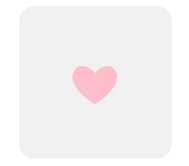
    content: '❤';
    position: absolute;
    left:100px;
    top: 100px;
    float: left;
    color: pink;
    font-size: 100px;
    line-height: 1;
    animation: heartbeat 1s 3 ease; /*심장 아이콘 애니메이션 반복 횟수(iterate)는 3회 */
}
.counter{/* 자바스크립트 이벤트 처리 메시지 출력 */
    text-align: center;
    color: pink;
}
/* 크기가 변하는 심장 아이콘 키프레임 애니메이션 */
@keyframes heartbeat {
    0% {
        transform: scale(1.0);
    }
    50% {
        transform: scale(1.3);
    }
    100% {
        transform: scale(1.0);
    }
}

@keyframes heartbeat2 {
    from {
        transform: scale(1.0);
    }
    to {
        transform: scale(1.3) translate(10px, 10px);
    }
}
🔶 01-02 transition
🔶HTML
<!DOCTYPE html>
<html lang="en">
<head>
    <meta charset="UTF-8">
    <meta name="viewport" content="width=device-width, initial-scale=1.0">
    <title>트랜스폼과 트랜지션</title>
    <link rel="stylesheet" href="transition.css">
</head>
<body>
    <div class="coloring">

        <div class="box">변형<br/>요소</div>
    </div>
</body>
</html>
🔶CSS
div.coloring{
    background-image: linear-gradient(45deg, rgba(255,0,36,1) 0%, rgba(255,9,121,1) 35%, rgba(0,212,255,1) 100%);
    background-color: #f0f0f0;
    width: 300px;
    height: 300px;
    margin: 0 auto;
    transition: background-image 1s ease;
    position: relative;
}
div.coloring:hover{
    /* background-image: linear-gradient(45deg, rgba(0,0,255,1) 0%, rgba(0,9,121,255) 35%, rgba(255,212,0,1) 100%); */
}
div{
    background-color: #fff;
}
div.box{
    float: left;
    width: 100px;
    height: 100px;
    background-color: #fff;
    transform: translate(200px, 200px) rotate(360deg);
    transition: all 1s ease 1s;
}
div.box2{
    float: right;
    width: 100px;
    height: 100px;
    transition: all 0.5s ease;
    transform: scale(1.3) translate(-100px, 100px) rotate(180deg);
}
div.box3{
    float: left;
    width: 100px;
    height: 100px;
    border: 1px solid pink;
    box-shadow: 0 0 15px -5px rgba(0,0,0,0.4);
    transform: scale(1.3) translate(100px, 100px) rotate(120deg);
    transition: transform 2s ease;
}
div.box4{
    float: left;
    width: 100px;
    height: 100px;
    border: 1px solid pink;
    box-shadow: 0 0 15px -5px rgba(0,0,0,0.4);
    animation: a 1s infinite alternate ease; /* 키프레임 애니메이션 적용 */
}
@keyframes a{
    to{
        transform: scale(1.3) translate(100px, 100px) rotate(120deg);
    }
}
🟦 02-fillmode
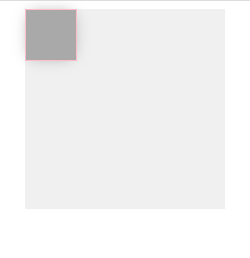
애니메이션이 시작되기 전이나 끝나고 난 후 어떤 값이 적용될지 지정합니다.
🔶HTML
<!DOCTYPE html>
<html lang="en">
<head>
    <meta charset="UTF-8">
    <meta name="viewport" content="width=device-width, initial-scale=1.0">
    <title>채우기모드의 이해</title>
    <link rel="stylesheet" href="./fillmode.css">
</head>
<body>
<div class="wrap">
    <div class="box"></div>
</div>
</body>
</html>
🔶CSS
.wrap{
    /*background-image: linear-gradient(45deg, rgba(255,0,36,1) 0%, rgba(255,9,121,1) 35%, rgba(0,212,255,1) 100%);*/
    background-color: #f0f0f0;
    width: 200px;
    height: 200px;
    margin: 0 auto;
    transition: background-image 1s ease;
    position: relative;
    background-color: #f0f0f0;
}
.box{
    float: left;
    width: 50px;
    height: 50px;
    border: 1px solid pink;
    box-shadow: 0 0 15px -5px rgba(0,0,0,0.4);
    background-color: darkgray;
    animation: rotate 1s steps(5, end) 1 none;
}
@keyframes rotate{
    from{
        background-color: pink;
    }
    to{
        background-color: lightblue;
        transform: scale(1.3) translate(100px, 100px) rotate(360deg);
    }
}
필모드 문법
/* Single animation */
animation-fill-mode: none;
animation-fill-mode: forwards;
animation-fill-mode: backwards;
animation-fill-mode: both;

/* Multiple animations */
animation-fill-mode: none, backwards;
animation-fill-mode: both, forwards, none;
🟦 02-animation-direction
애니메이션이 앞으로, 뒤로 또는 앞뒤로 번갈아 재생되어야하는지 여부를 지정합니다.
/* Single animation */
animation-direction: normal;
animation-direction: reverse;
animation-direction: alternate;
animation-direction: alternate-reverse;

/* Multiple animations */
animation-direction: normal, reverse;
animation-direction: alternate, reverse, normal;

/* Global values */
animation-direction: inherit;
animation-direction: initial;
animation-direction: unset;

--------------------------------------------------------------------
normal
애니메이션은 매 사이클마다 정방향으로 재생됩니다. 즉, 순환 할 때마다 애니메이션이 시작 상태로 재설정되고 다시 시작됩니다. 이것은 기본값입니다.

reverse
애니메이션은 매 사이클마다 역방향으로 재생됩니다. 즉, 순환 할 때마다 애니메이션이 종료 상태로 재설정되고 다시 시작됩니다. 애니메이션 단계가 거꾸로 수행되고 타이밍 기능 또한 반대로됩니다. 예를 들어, ease-in 타이밍 기능은 ease-out형태로 변경됩니다.

alternate
애니메이션은 매 사이클마다 각 주기의 방향을 뒤집으며, 첫 번째 반복은 정방향으로 진행됩니다. 사이클이 짝수인지 홀수인지를 결정하는 카운트가 하나에서 시작됩니다.

alternate-reverse
애니메이션은 매 사이클마다 각 주기의 방향을 뒤집으며, 첫 번째 반복은 역방향으로 진행됩니다. 사이클이 짝수인지 홀수인지를 결정하는 카운트가 하나에서 시작됩니다.
🟦 03-multi-animations
🔶HTML
<!DOCTYPE html>
<html lang="en">
<head>
    <meta charset="UTF-8">
    <meta name="viewport" content="width=device-width, initial-scale=1.0">
    <title>멀티 애니메이션</title>
    <link rel="stylesheet" href="./multianimations.css">
</head>
<body>
<div class="wrap">
    <div class="box"></div>
</div>
</body>
</html>
🔶CSS
.wrap{
    /*background-image: linear-gradient(45deg, rgba(255,0,36,1) 0%, rgba(255,9,121,1) 35%, rgba(0,212,255,1) 100%);*/
    background-color: #f0f0f0;
    width: 200px;
    height: 200px;
    margin: 0 auto;
    transition: background-image 1s ease;
    position: relative;
    background-color: #f0f0f0;
}
.box{
    float: left;
    width: 50px;
    height: 50px;
    border: 1px solid pink;
    box-shadow: 0 0 15px -5px rgba(0,0,0,0.4);
    background-color: darkgray;
    animation: rotate 2s linear, scale 1s ease;
}
@keyframes rotate{
    from{
        background-color: pink;
    }
    to{
        background-color: lightblue;
        transform: translate(100px, 100px) rotate(360deg);
    }
}
@keyframes scale{
    to{
        background-color: black;
        transform: scale(1.3);
    }
}
🔶HTML2
<!DOCTYPE html>
<html lang="en">
<head>
    <meta charset="UTF-8">
    <meta name="viewport" content="width=device-width, initial-scale=1.0">
    <title>멀티 애니메이션</title>
    <link rel="stylesheet" href="./multianimations-caution.css">
</head>
<body>
<div class="wrap">
    <div class="box"></div>
</div>
</body>
</html>
🔶CSS2
body{
    padding-top: 100px;
}
.wrap{
    /*background-image: linear-gradient(45deg, rgba(255,0,36,1) 0%, rgba(255,9,121,1) 35%, rgba(0,212,255,1) 100%);*/
    background-color: #f0f0f0;
    width: 200px;
    height: 200px;
    margin: 0 auto;
    transition: background-image 1s ease;
    position: relative;
    background-color: #f0f0f0;
}
.box{
    float: left;
    width: 50px;
    height: 50px;
    border: 1px solid pink;
    box-shadow: 0 0 15px -5px rgba(0,0,0,0.4);
    background-color: darkred;
    animation: rotate 2s linear backwards, scale 2s linear 1s forwards;
}
@keyframes rotate{
    to{
        background-color: lightblue;
        transform: translate(100px, 100px) rotate(360deg);
    }
}
@keyframes scale{
    to{
        background-color: black;
        transform: scale(1.5);
    }
}
🟦 04-변수 애니메이션
🔶01
▪️HTML-1
<!DOCTYPE html>
<html lang="en">
<head>
    <meta charset="UTF-8">
    <meta name="viewport" content="width=device-width, initial-scale=1.0">
    <title>변수를 이용해 애니메이션 만들기1</title>
    <link rel="stylesheet" href="./variable1.css">
</head>
<body>
<div class="wrap">
    <div class="box"></div>
    <div class="box"></div>
    <div class="box"></div>
    <div class="box"></div>
    <div class="box"></div>
</div>
</body>
</html>
▪️CSS-1
.wrap{
    width: 300px;
    height: 300px;

    border-radius: 30px;
    margin: 0 auto;
    position: relative;
}

.box{
    left:100px;
    top: 100px;
}
.box:nth-child(1){
    --size: 1.6;
}
.box:nth-child(2){
    --size: 1.5;
}
.box:nth-child(3){
    --size: 2;
}
.box:nth-child(4){
    --size: 2.8;
}
.box:nth-child(5){
    --size: 1.3;
}
.box::before{
    content: '❤';
    position: absolute;
    display: inline-block;
    left: 100px;
    top: 100px;
    color: pink;
    font-size: 75px;
    line-height: 1;
    animation: heartbeat 2s infinite ease;
}

@keyframes heartbeat {
    to {
        transform: scale(calc(var(--size)*2));
        opacity: 0;
    }
}
🟦 05-path-animation
🔶01
▪️html-1
<!DOCTYPE html>
<html lang="en">
<head>
    <meta charset="UTF-8">
    <meta name="viewport" content="width=device-width, initial-scale=1.0">
    <title>경로 애니메이션1</title>
    <link rel="stylesheet" href="pathanimation1.css">
</head>
<body>
    <div class="coloring">
        <div class="box"></div>
    </div>
</body>
</html>
▪️css-1
div.coloring{
    /*background-image: linear-gradient(45deg, rgba(255,0,36,1) 0%, rgba(255,9,121,1) 35%, rgba(0,212,255,1) 100%);*/
    background-color: #f0f0f0;
    width: 300px;
    height: 300px;
    margin: 0 auto;
    transition: background-image 1s ease;
    position: relative;
}
div.coloring:hover{
    /* background-image: linear-gradient(45deg, rgba(0,0,255,1) 0%, rgba(0,9,121,255) 35%, rgba(255,212,0,1) 100%); */
}
div{
    background-color: #fff;
}

div.box{
    position: absolute;
    left: 70px;
    top: 70px;
    width: 60px;
    height: 60px;
    background-color: #a00;
    border: 5px solid pink;
    box-shadow: 0 0 15px -5px rgba(0,0,0,0.4);
    border-radius: 35px;
    animation: moveto 1s infinite alternate ease;
}
@keyframes moveto{
    25% {
        transform: translate(100px, 0px);
    }
    50%{
        transform: translate(100px, 100px);
    }
    75%{
        transform: translate(0px, 100px);
    }
    100%{
        transform: translate(0px, 0px);
    }
}
🔶02
▪️html-2
<!DOCTYPE html>
<html lang="en">
<head>
    <meta charset="UTF-8">
    <meta name="viewport" content="width=device-width, initial-scale=1.0">
    <title>경로 애니메이션2</title>
    <link rel="stylesheet" href="pathanimation2.css">
</head>
<body>
    <div class="wrap">
        <div class="box"></div>
    </div>
</body>
</html>
▪️css-2
.wrap{
    background-color: #f0f0f0;
    width: 600px;
    height: 200px;
}

.box{
    position: absolute;
    left: 70px;
    top: 70px;
    width: 60px;
    height: 60px;
    background-color: #a00;
    border: 5px solid pink;
    box-shadow: 0 0 15px -5px rgba(0,0,0,0.4);
    border-radius: 35px;
    offset: path('M0,100c10,-50 82.095,-82.507 127.089,0c19.734,-79.314 119.195,-102.241 151.559,0c5.526,-77.735 101.322,-104.262 149.192,-52.888') auto;
    animation: moveto 5s ease;
}
@keyframes moveto{
    0%{
        offset-distance: 0%
    }
    100%{
        offset-distance: 100%;
    }
}
🔶03
▪️html-3
<!DOCTYPE html>
<html lang="en">
<head>
    <meta charset="UTF-8">
    <meta name="viewport" content="width=device-width, initial-scale=1.0">
    <title>경로 애니메이션3</title>
    <link rel="stylesheet" href="pathanimation3.css">
</head>
<body>
    <div class="wrap">
        <div class="box"></div>
    </div>
</body>
</html>
▪️css-3
.wrap{
    background-color: #f0f0f0;
    width: 600px;
    height: 200px;
}

.box{
    position: absolute;
    left: 70px;
    top: 70px;
    width: 60px;
    height: 60px;
    background-color: transparent;
    offset: path('M0,100c10,-50 82.095,-82.507 127.089,0c19.734,-79.314 119.195,-102.241 151.559,0c5.526,-77.735 101.322,-104.262 149.192,-52.888') auto;
    animation: moveto 5s ease;
}
.box::after{
    content:url(./img/twitter_logo_original.svg);
    display: block;
}
@keyframes moveto{
    0%{
        offset-distance: 0%
    }
    100%{
        offset-distance: 100%;
    }
}


🟦 06 썸네일호버1
🔶html
<!DOCTYPE html>
<html lang="ko">
	<head>
		<meta charset="UTF-8" />
		<meta name="viewport" content="width=device-width, initial-scale=1" />
		<title>CSS3 애니메이션</title>
		<style>
			#container {
				width: 1000px;
				margin: 20px auto;
			}
			h1 {
				text-align: center;
			}
			.prod-list {
				list-style: none;
				padding: 0;
			}
			.prod-list li {
				float: left;
				padding: 0;
				margin: 10px;
				overflow: hidden;
			}
			.prod-list img {
				margin: 0;
				padding: 0;
				float: left;
				z-index: 5;
			}
		</style>
	</head>
	<body>
		<div id="container">
			<h1>신상품 목록</h1>
			<ul class="prod-list">
				<li>
					<img src="https://placedog.net/300/200?random" />
					<div class="caption">
						<h2>상품 1</h2>
						<p>상품 1 설명 텍스트</p>
						<p>가격 : 12,345원</p>
					</div>
				</li>
				<li>
					<img src="https://placedog.net/300/200?random" />
					<div class="caption">
						<h2>상품 2</h2>
						<p>상품 2 설명 텍스트</p>
						<p>가격 : 12,345원</p>
					</div>
				</li>
				<li>
					<img src="https://placedog.net/300/200?random" />
					<div class="caption">
						<h2>상품 3</h2>
						<p>상품 3 설명 텍스트</p>
						<p>가격 : 12,345원</p>
					</div>
				</li>
			</ul>
		</div>
	</body>
</html>
▪️css-1
div.coloring{
    /*background-image: linear-gradient(45deg, rgba(255,0,36,1) 0%, rgba(255,9,121,1) 35%, rgba(0,212,255,1) 100%);*/
    background-color: #f0f0f0;
    width: 300px;
    height: 300px;
    margin: 0 auto;
    transition: background-image 1s ease;
    position: relative;
}
div.coloring:hover{
    /* background-image: linear-gradient(45deg, rgba(0,0,255,1) 0%, rgba(0,9,121,255) 35%, rgba(255,212,0,1) 100%); */
}
div{
    background-color: #fff;
}

div.box{
    position: absolute;
    left: 70px;
    top: 70px;
    width: 60px;
    height: 60px;
    background-color: #a00;
    border: 5px solid pink;
    box-shadow: 0 0 15px -5px rgba(0,0,0,0.4);
    border-radius: 35px;
    animation: moveto 1s infinite alternate ease;
}
@keyframes moveto{
    25% {
        transform: translate(100px, 0px);
    }
    50%{
        transform: translate(100px, 100px);
    }
    75%{
        transform: translate(0px, 100px);
    }
    100%{
        transform: translate(0px, 0px);
    }
}